Rotational Symmetry | What it is and why we love it

If you went to architecture school, you may have had that professor that liked to take your drawings or cardboard models and flip them upside down. While it may have been insulting at first, the forced change of perspective often did result in unforeseen and hidden moments of inspiration. It's amazing how often the "flip” finds its way into our daily design process. "Rotational Symmetry" is one such flipping technique that is all around us. You’ll see it in graphic & logo design, industrial design, product design, and even the occasional building. Sometimes the solution is purely aesthetic and symbolic: think of the Yin & Yang symbol or the Recycling logo, each element wrapping around itself. Sometimes the solution is purely functional: think of the repeated blades of a wind turbine or the cogs of a gear. We find the notion of repeating a single component in a not-so-obvious way to create whole new forms, geometries, or spaces to be endlessly fascinating.

Examples of Rotational Symmetry in Architecture:

Symmetry and balance have been revered as architectural tenets for centuries, going back to Vitruvius’s Ten Books on Architecture circa 1st century Rome and before. When people say something has symmetry, they are usually referencing the use of an implied “Line of Symmetry” where each side of the object is a mirror to the other. Rotational symmetry goes one step further with repeating a form or mass around a fixed point. Intrigued by the notion of ‘complexity within simplicity’ and creating a measured dynamic, we studied historical precedents that inspired many of our recent designs.
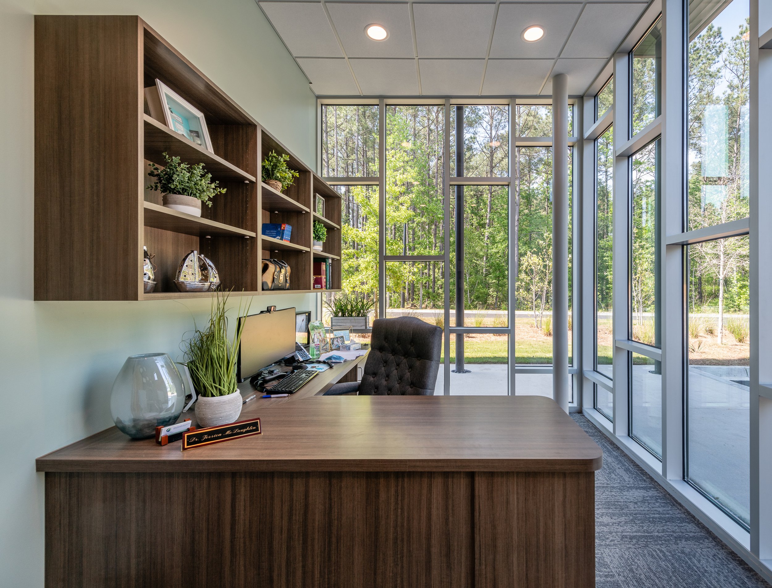
DAYFIELD PARK

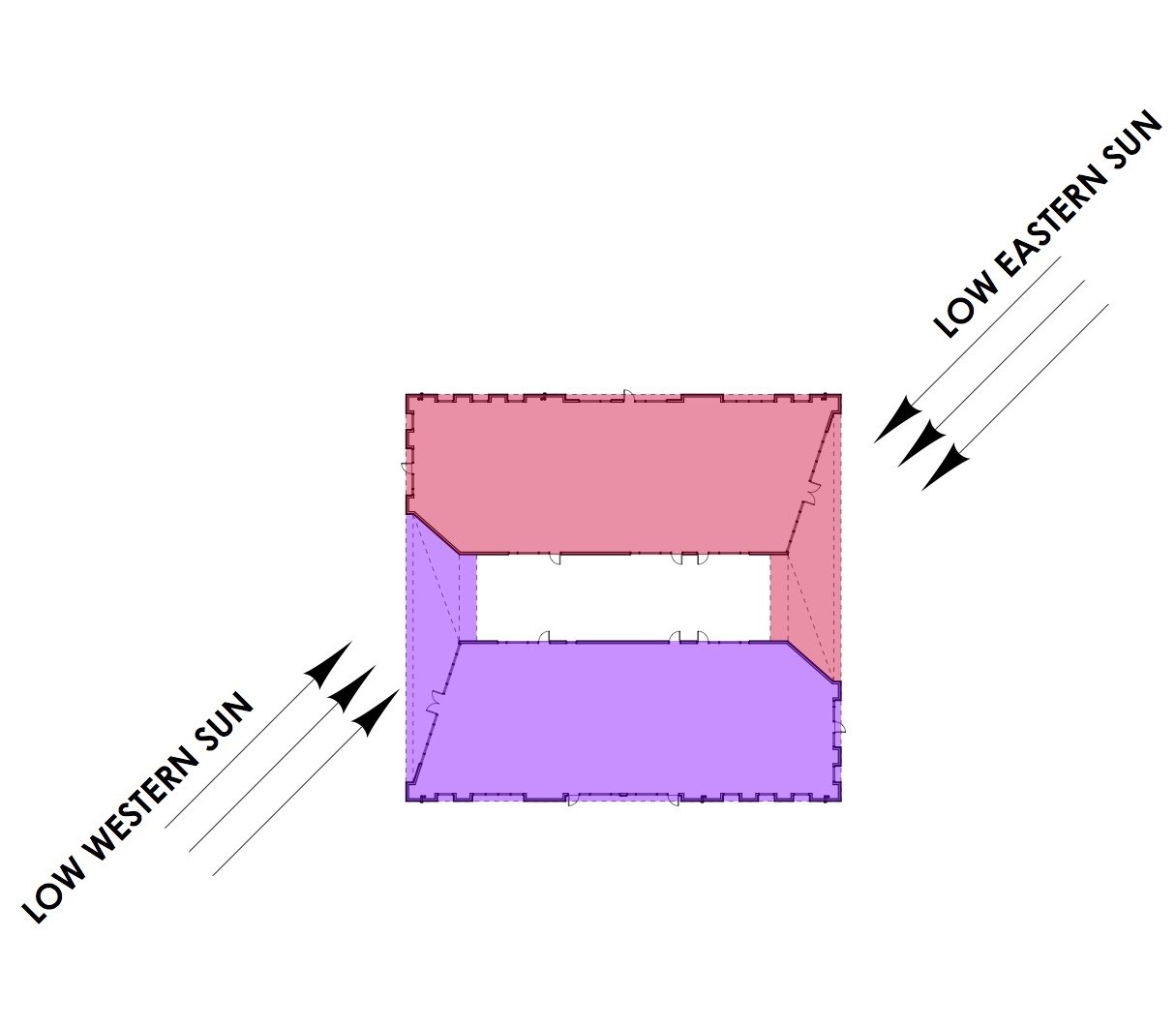
The design approach for Building B at Dayfield Park, a soon to be commercial destination in the award-winning Nexton Community, is rooted in strong massing, innovative detailing and creating an inspiring place to work and do business. The program included providing space for offices and retail tenants in a single story building while creating a unique and modern business park that engaged with adjacent green spaces and supported the current day work place expectations. The resulting design used rotational symmetry to leverage the square footprint by creating a central courtyard and through two overhead ‘thresholds’. The dynamic suggestion is amplified by angled walls and highly textured surfaces. Click here for more about the project.

RDA’S SUBMISSION FOR THE NORTH CHARLESTON FLAG

Earlier this year, the City of North Charleston launched a public design competition to select a new City flag. One of the symbols used in our submission was a reference to Park Circle (a derivative of a Garden City urban plan). By deconstructing the graphic and using rotational symmetry, we were able to invoke dynamics as if in rotating motion. Click here for more on our flag design.

CAMP HALL PARK PAVILION

Santee Cooper’s Camp Hall is a next generation commerce park where “people, nature and productivity connect.” With state-of-the-art manufacturing in a setting of vast natural beauty, the design concept of “Nature and the Machine” permeates the built environment. Like the vehicles and machines produced in Camp Hall, the Architecture is intended to embody precision, sleekness and innovation. The building forms are abstract interpretations of the patterns, colors, and figures found in nature. Specifically, the Park Pavilion uses rotational symmetry to create a subtle dynamic-ness of the roof planes. Click here for more on the project.

FIREFLY DISTILLERY GIFT SHOP FIXTURES

Part of our scope when we were designing Firefly Distillery’s new facility in North Charleston, SC was to carry the building’s design concepts to the gift shop merchandise fixtures. Using barrel lids, steel pipes, and rotational symmetry, a simple solution was created.

Details of Rome

We fully recognize that as architects we are not normal tourists; we look up, we look down, we try to figure out floor plans, we look at the tiny details and run our hands over walls. It’s a little extra but this is how we learn. Therefore most of our travel photos are not of the typical framed postcard views, rather small moments that catch our breath and tell a story. Here are some details from our pre-pandemic trip to Rome.

IMG_1226.jpg
IMG_1246.jpg
IMG_1247.jpg
IMG_7393.jpg
IMG_1339.jpg
IMG_E7390.jpg
IMG_1269.jpg
We weren’t the first to look through the Aventine keyhole (see photo above for a close up) near S. Sabina which gives a perfectly framed view of St. Peter’s Basilica on axis, through the gardens.  Read more about it here.

We weren’t the first to look through the Aventine keyhole (see photo above for a close up) near S. Sabina which gives a perfectly framed view of St. Peter’s Basilica on axis, through the gardens. Read more about it here.

Product Design by Architects

Attending architecture school is often regarded as the foundation for establishing a rigorous design process. This can then be applied not only to designing buildings, but other disciplines of varying scales such as urban design, graphic design, furniture design or in Rush’s case, product design. We have always drawn inspiration from architects who toggle between such scales or disciplines. Some of our favorites include:

Aldo Rossi (1931 - 1997) 

An Italian architect and leader of the postmodern movement, Rossi was known for built works of architecture, theory, drawing and product design. We first saw his “Il Conico" tea kettle and “La Conica" espresso coffee maker for Alessi and knew it was no ordinary design.  

Charles-Edouard Jeanneret (1887 - 1965) 

“Le Corbusier” as he was known as, was an architect, designer, painter, urban planner and writer. Notable works of architecture include the Villa Savoye and the Ronchamp chapel and collaborations with his cousin, Pierre Jeanneret, led to several iconic pieces of modern furniture that we have all likely seen, such as the sling chair. 

Philippe Starck (1949) 

French architect, Philippe Starck is known for cultural venues and hotels, also designed yachts and furniture. The iconic juicer is our favorite.

Rush3 Product Design Studio

Truth be told, a slow economy, a goal set 10 years prior, and a chance encounter with a vintage bottle opener led to the creation of Rush3 Product Design Studio in 2011.  Local branding company Slant Media made the process of starting a product design company including logo creation, web site development and product branding fun and extremely exciting.  The next several years were a mixture of architecture and product design - using the design process to jump scales and functions. Some highlights of the Rush3 Product Design Studio chapter…

Kebo® - One Handed Bottle Opener

Inspired by the Theodore Low bottle opener from the 1930s, the Kebo Bottle Opener is a modern interpretation that offered better seamless function and classic styling. It was cast of stainless steel and polished to a mirror finish because it needed to feel good in your hand and be a sculptural if not architectural piece. The “Kebo®, short for “bottle key”, won the Innovation Award in the ‘Handtools and Cutlery’ category at the 2012 International Home and Housewares Show. Fun times were had in research and development (yes, we drank a lot of beer) as well as press in Men’s Journal, Core 77, Buzzfeed, Fast Company and the Today Show. Kebo was sold at many local shops, small businesses and even Restoration Hardware and the Museum of Modern Art.

Kebo® The One Handed Bottle Opener is a 2012 International Home and Housewares Show Innovation Award winner, was featured on The Today Show and was named as one of Men’s Journal’s “Perfect Things”

Kebo® The One Handed Bottle Opener is a 2012 International Home and Housewares Show Innovation Award winner, was featured on The Today Show and was named as one of Men’s Journal’s “Perfect Things”

Kebo Light

Anyone in the product industry knows that before long, knock-offs sprout up.  At first when a colleague suggested we do our “own knock-off” we thought it impossible to consider anything other than the pure, stainless steel original Kebo. But when attending industry trade shows we were shocked to see derivations of last show’s newest products be presented as their own fresh ideas. It’s rough out there even with trademarks and patents in place. Enter “Kebo LIght.” A different iteration of the original Kebo with a nod to light beer.  It was lightweight (made from aluminum) and available in colors so this captured a lower price point and more of an impulse buy - a bottle opener you would have on the boat or at tailgates.  

Kebo® Light offers the same elegant design extruded from lightweight aluminum making it perfect for picnics, a day at the beach or any time on-the-go.

Kebo® Light offers the same elegant design extruded from lightweight aluminum making it perfect for picnics, a day at the beach or any time on-the-go.

Munch Stix®

One night when having take-out Chinese for dinner, our then 7 year old asked for chopsticks but mispronounced them saying “chomp” instead. This was a good chuckle, but then we said, what if chopsticks could actually chomp. After initial launch, a bit of a trademark hiccup had us re-brand to “Munch Stix.” We still had fun with “Chum” the shark, “Al” the alligator and “Teri” the Pterodactyl as kid-friendly chopsticks. These were a finalist for the 2013 International Housewares Association Innovation Award (Tabletop category) and made the rounds on mom-blogs including Cool Mom Picks and A-List Mom.  Retailers included kitchen and toy shops as well as the Museum of Natural History and the Georgia Aquarium. 

Munch Stix® are child-friendly chopsticks that all have mouths and munch! Made in the USA, Munch Stix® are an AmericasMart ICON Honors Innovation Award finalist, an Editor's Pick for The Gourmet Retailer and one of A-List Mom's "Toy of the Year" in …

Munch Stix® are child-friendly chopsticks that all have mouths and munch! Made in the USA, Munch Stix® are an AmericasMart ICON Honors Innovation Award finalist, an Editor's Pick for The Gourmet Retailer and one of A-List Mom's "Toy of the Year" in 2014. Meet "Chum the Shark" who has also been endorsed by pediatric Occupational Therapist, Lindsey Biel OTR/L.

"Al the Alligator" Munch Stix® was featured in Sharon Garofalow's "Cupcakes and Cutlery" blog and named, along with his sibllings, as a 2015 Family Choice Award Winner.

"Al the Alligator" Munch Stix® was featured in Sharon Garofalow's "Cupcakes and Cutlery" blog and named, along with his sibllings, as a 2015 Family Choice Award Winner.

"Teri the Pterodactyl" Munch Stix® was the cover girl for Fancy Food & Culinary Products Magazine in June of 2013.

"Teri the Pterodactyl" Munch Stix® was the cover girl for Fancy Food & Culinary Products Magazine in June of 2013.

Tre™ Bottle Opener

Returning to the bottle opener space (because beer) the last product Rush3 Studio designed and produced was a sculptural triple function beer opener crafted and contoured for 1) twist-off bottles, 2) pry-off bottles and 3) can tabs. We did a small run of these in 2017 mainly for client gifts and local sales. 

Released in November of 2017, TRE is a triple-function bottle opener crafted and contoured out of stainless steel for twist-off bottles, pry-off bottles and can tabs.

Released in November of 2017, TRE is a triple-function bottle opener crafted and contoured out of stainless steel for twist-off bottles, pry-off bottles and can tabs.


Certainly a great education not only in jumping design scales and function from buildings to housewares, but in dipping our toes in the product / retail sector. We have since dialed down the product design studio for now and have been focusing on architecture in the Charleston metro area. Though we still enjoy designing at a range of scales and are life-long fans of modern product design. 

Distillery Homework

We are nothing but life-long learners and curious creatives. The discovery and research phase of a new project is when we immerse ourselves in the client / industry and where relevant pieces of information are uncovered; we may not know exactly how they will be incorporated in the final project design, if at all, but we collect them none the less as we begin to conceptualize a design. After a period (sometimes short, sometimes long) of researching, studying and marinating with the history, images, precedents collected - the design concept is crafted with memories of these discoveries.

When we began the design phase for Firefly Distillery’s new facility, the first step was to visit their existing distillery and tasting room on Wadmalaw Island, SC to learn their history, better understand their brand, see their process, and well, taste some products. It was important for us to know how Firefly started and where they were going, how they differentiated themselves in the industry and thus what functional spaces and visitor experiences to help create in the architecture.

Original Firefly Tasting Room located in an old horse barn on Wadmalaw Island, SC.

Original Firefly Tasting Room located in an old horse barn on Wadmalaw Island, SC.

Products on display and for sale inside the Tasting Room.

Products on display and for sale inside the Tasting Room.

Becoming experts in Firefly’s brand and business was only the first step. We needed to visit other distilleries with successful brands, products and distillery tours, so the team headed to Kentucky for some serious homework. (There are worse things to have on one’s To-do list.) The goal was to visit several distilleries of varying size and personality to study the visitor experience - this was not to replicate any one of them, rather to understand varying ways to showcase a brand, tell a story and how the built environment supports the experience. We’re not going to lie - a great time was had by all; but more importantly, the research trip provided countless moments to document and reference during the next year of design work.

BUFFALO TRACE

Located in Frankfurt, KY, Buffalo Trace is a National Historic Landmark and heavy hitter with over 20 brands including Van Winkle, Sazarac Rye and Wheatley Vodka. Take aways include their expansive, historic campus, choice of multiple tours and events (including a behind the scenes “hard hat” tour, path of a bourbon barrel tour and a ghost tour), and how their rustic brand is reinforced throughout the grounds in both big and small ways.

DSC_0518.JPG
Inside of one of the historic rickhouse structures.

Inside of one of the historic rickhouse structures.

Buffalo Trace logo cut into a stormwater grate.

Buffalo Trace logo cut into a stormwater grate.

WOODFORD RESERVE

The drive to Woodford Reserve in Versailles, KY was exactly how you wanted it to be, with horses and expanses of blue grass. While this distillery has a rich history as well, we noticed the polish and exactness they incorporated into the visitor experience.

Woodford Reserve’s information counter with backlit bottles.

Woodford Reserve’s information counter with backlit bottles.

There was a precise balance between the historic structure, distillery function and visitor experience.

There was a precise balance between the historic structure, distillery function and visitor experience.

The Woodford Reserve tasting experience was restrained, elegant and on-brand.

The Woodford Reserve tasting experience was restrained, elegant and on-brand.


COPPER & KINGS

In Louisville, KY our first stop was Copper & Kings, a newer distillery with an industrial aesthetic using shipping containers to greet you, a large courtyard for events and a steel, glass and concrete distillery. Bonus: they play music in the cellar for their barrels while they age. (Related: this blog was written to John Coltrane.)

Shipping container welcome center and gift shop for Copper & Kings.

Shipping container welcome center and gift shop for Copper & Kings.

Large outdoor courtyard with gathering spaces, fire pit and places to project movies.

Large outdoor courtyard with gathering spaces, fire pit and places to project movies.

Barrels age to music at the Copper & Kings’ cellar because “Brandy Rocks!” They post the day’s playlist on their website.

Barrels age to music at the Copper & Kings’ cellar because “Brandy Rocks!” They post the day’s playlist on their website.


ANGELS ENVY

Another stop in Louisville was Angel’s Envy, a VERY large facility that felt like a cathedral to distilling in the best way possible. It was reverent with grand spaces, a clear focus on education and showcasing the process and finished product.

Angel’s Envy Distillery map

Angel’s Envy Distillery map

IMG_E4482.jpg
The tallest column we have ever seen.

The tallest column we have ever seen.

Our design process is richer because we walked through these spaces, listened to the stories told and became students again. We are ever thankful for the hospitality shown to us and look forward to visiting again.