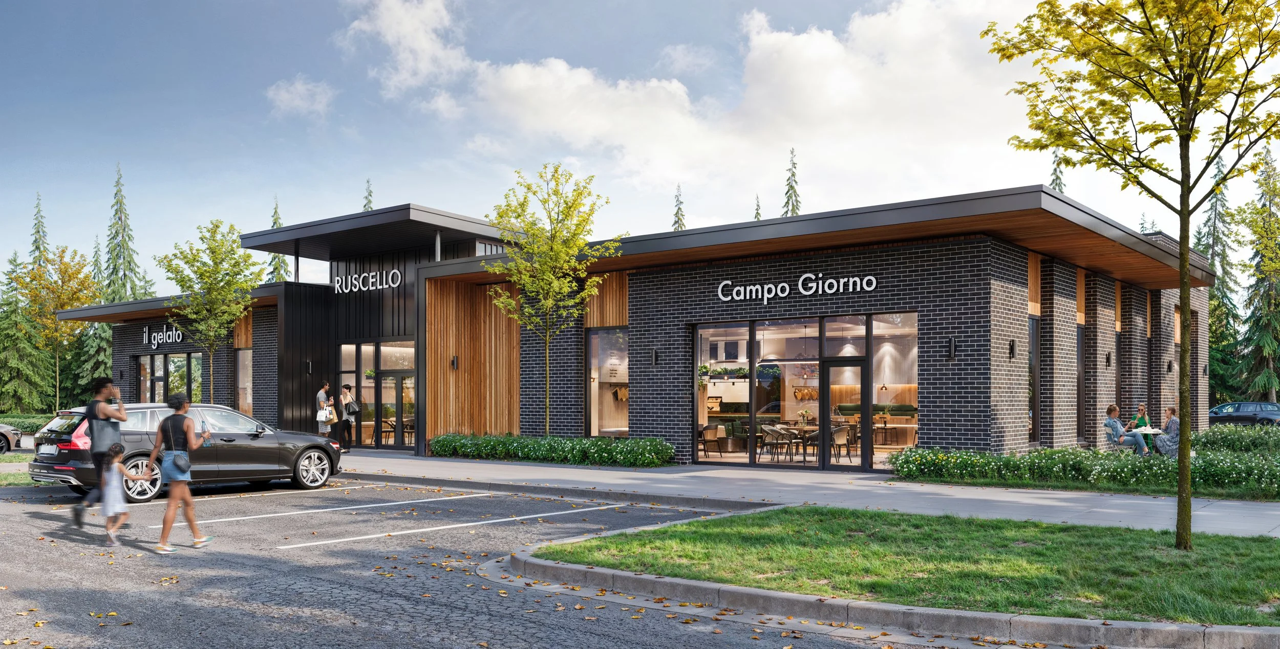
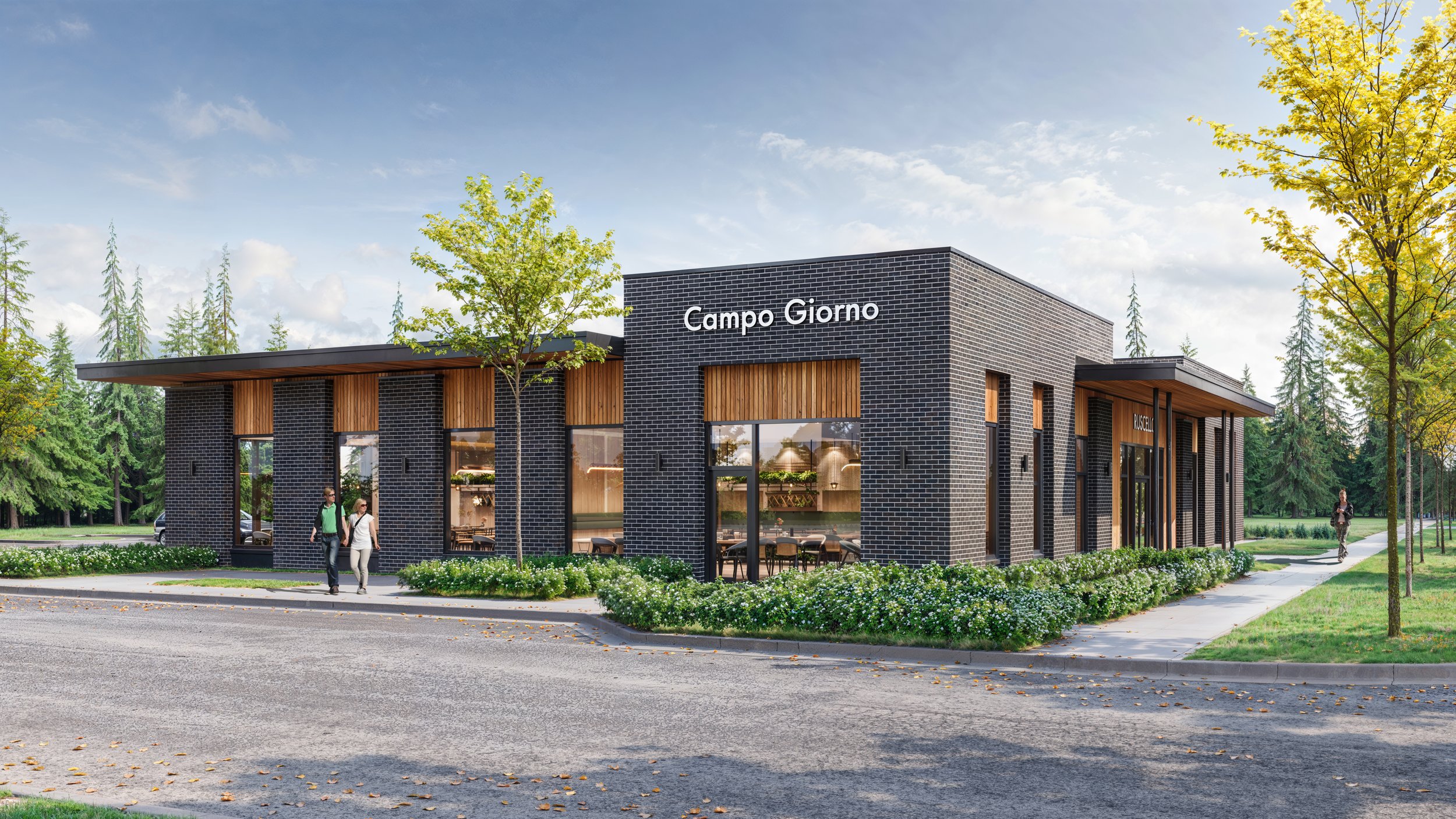
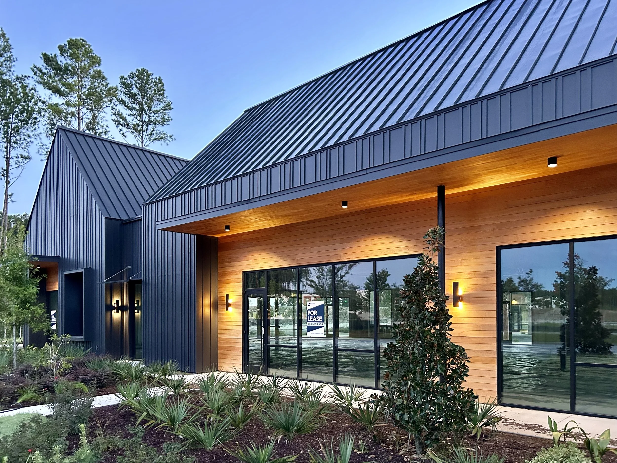
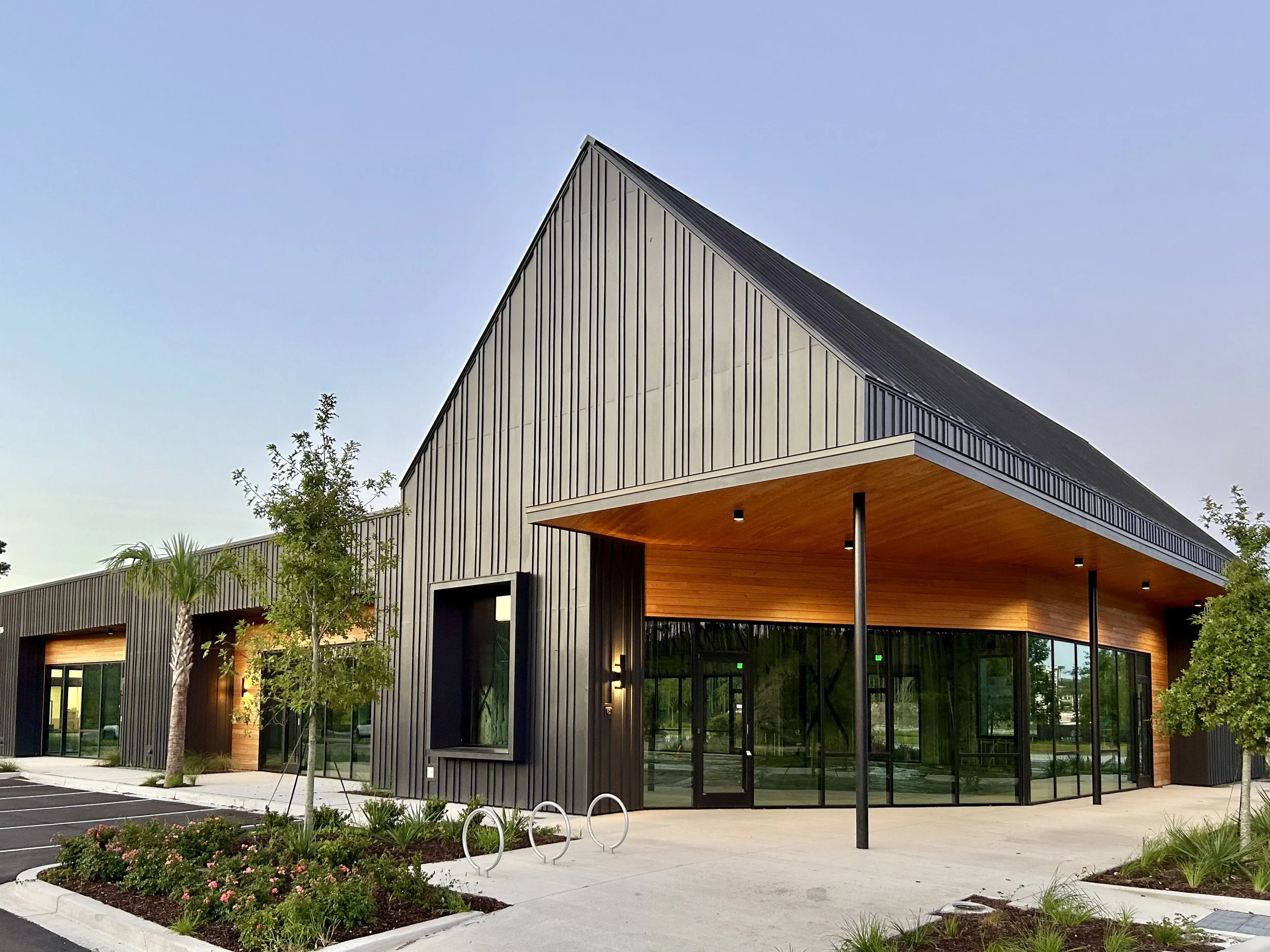
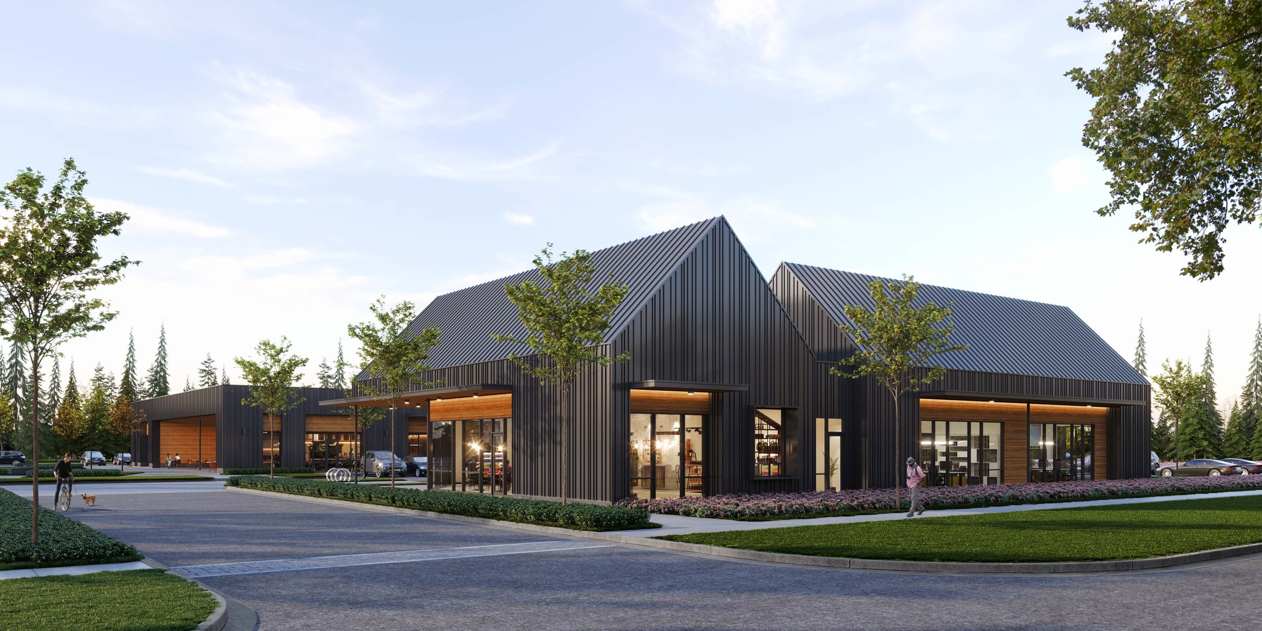
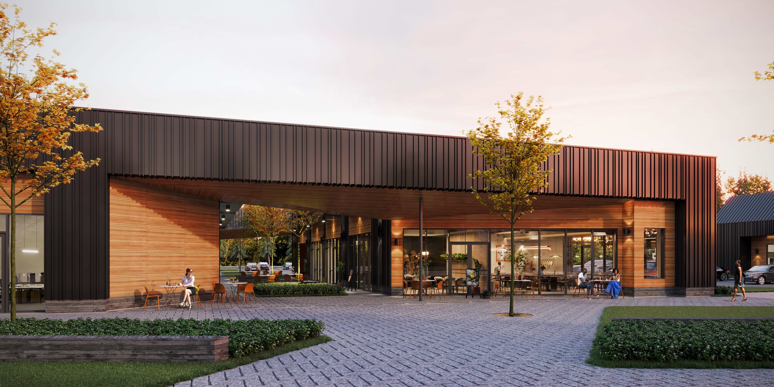
The second phase of Dayfield Park is nearing completion. Dayfield Park is a modern day commercial destination with a relevant mix of office, retail and hospitality in the award-winning Nexton Community, in Summerville, SC. The design approach for the buildings is rooted in strong massing, innovative detailing and creating an inspiring place to work, do business and socialize. The development includes multiple buildings by several local architects creating a varied interpretation linked by the same departure points: relevant and marketable commercial spaces, innovative yet locally inspired architecture and connecting the buildings with the thoughtful site design focusing on outdoor gathering areas for patrons and workers.
The project was subject to the Nexton community design guidelines which prioritize the following:
Architecture, land planning and landscape drawn from local and regional traditions but look to the future regarding specific design.
A commitment to sustainable design focused on protecting what we are here to enjoy and the creation of an overall healthier living environment.
Architecture - purposeful building designs that incorporate new and innovative building materials, systems, technologies and architectural expressions.
Use materials in innovative and unexpected ways.
Use clean, simple shapes in both massing and details.
Emphasize the relationship and flow between indoor and outdoor environments.
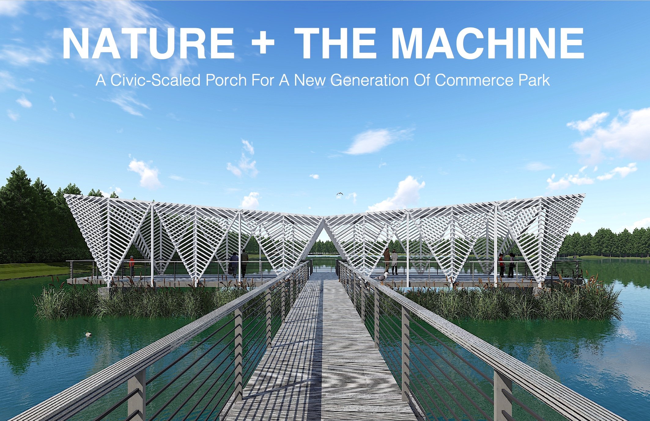
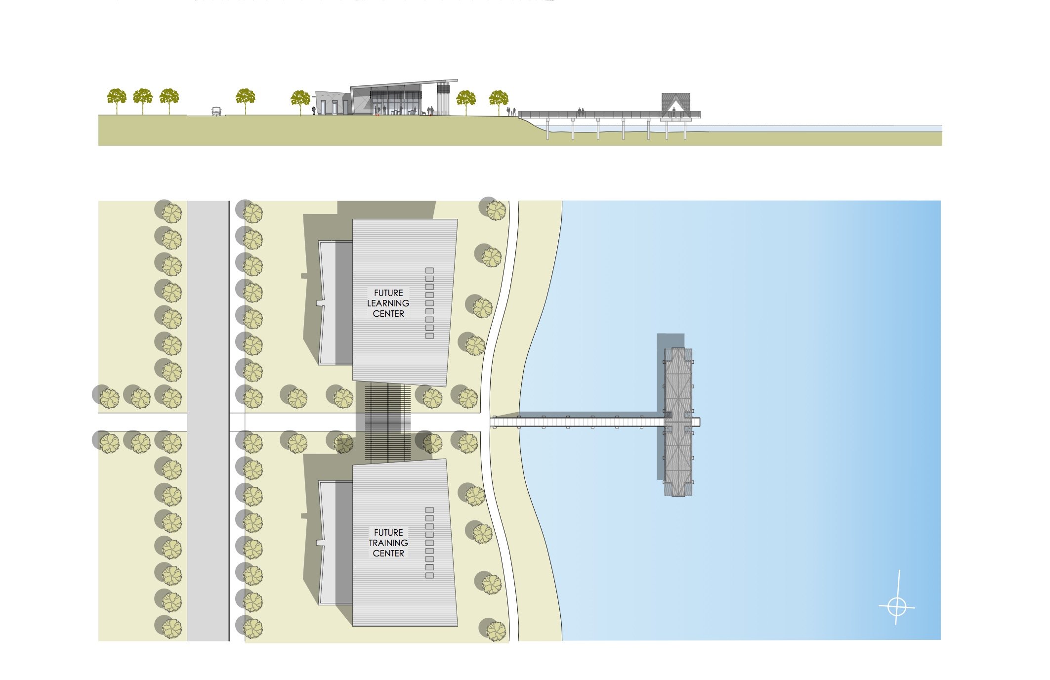
So what is a modern interpretation of a suburban office park? Today’s workforce wants to be connected to multiple uses, amenities, food + beverage options and outdoor space. Outdoor space can be passive, specific or flexible for all ages, uses and times of day; this also provides the ownership with an amenity to use for special events if desired. The blending of inside and outside is a strategy to allow patrons and workers to feel connected to the outdoor environs. Sidewalks and bike parking are important to offset the needed parking and vehicular pathways. During our research we found this interesting article from the New York TImes “The Suburban Office Park, an Aging Relic, Seeks a Comeback” which speaks to some lessons developers and designers could learn from the past. (The 80s might have been great for some things but not urban planning.)
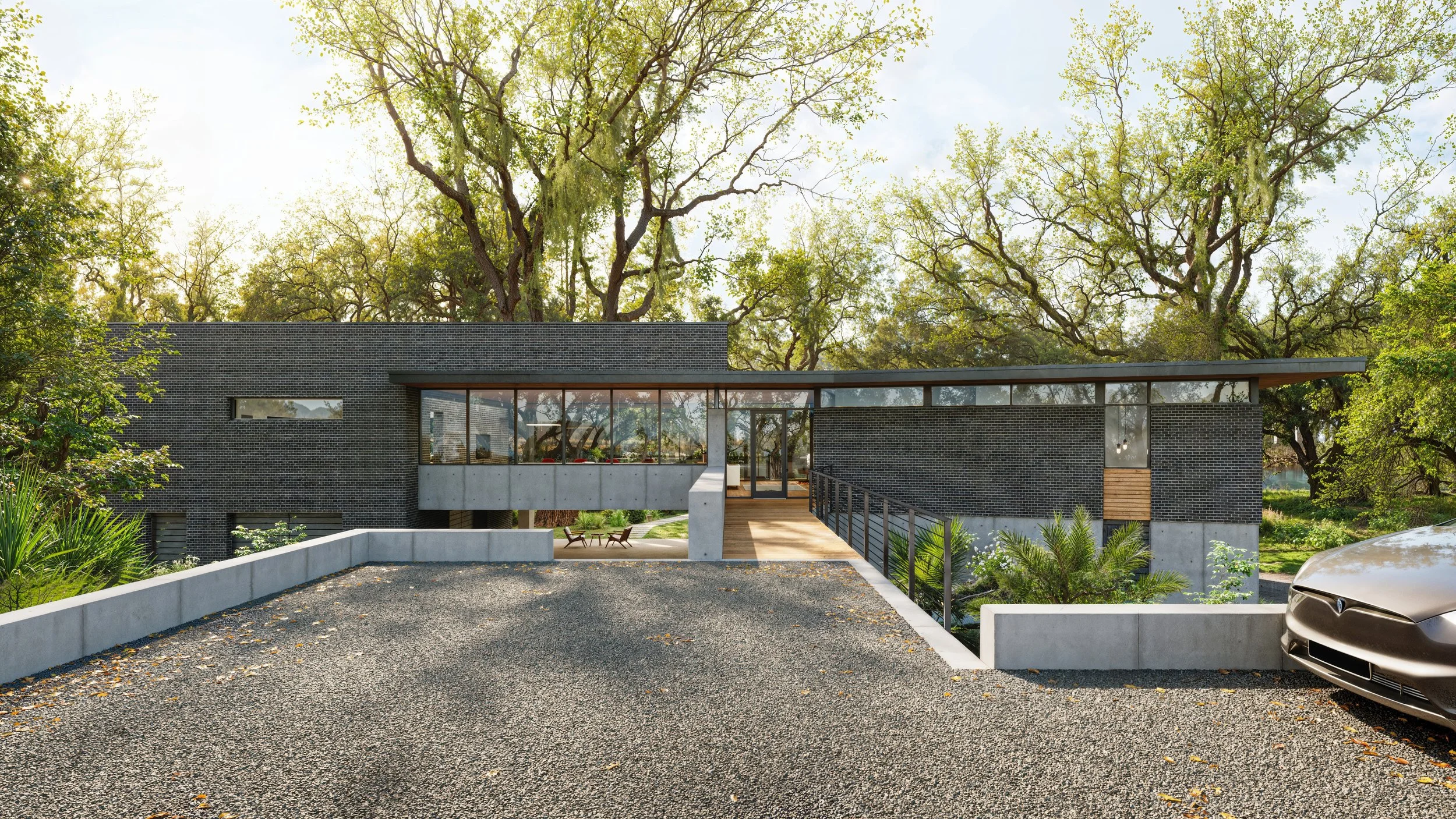
The architecture for our buildings cosigns a minimalist approach with materials familiar to the area. Exterior materials include a brick, modified board and batten wall system with varied batten spacing, cypress wood accents for warmth and standing seam metal roof panels for durability on the high slope areas. Special thanks to our clients for allowing us to be a part of this endeavor and the design team members we collaborated with:
Site Design: Seamon Whiteside
Structural Engineering: Tobias + West Engineering
Mech, Elec, Plumbing Engineering: Charleston Engineering
Branding: Obviouslee
General Contractor: Harbor Contracting
Leasing: Bridge Commercial
