Designing with Nature: Biophilic Inspiration at the Tideline CPA Office in Mount Pleasant, SC
Set on an infill lot in Mount Pleasant, South Carolina, the new 11,000-square-foot headquarters for Tideline CPA Group demonstrates how architecture can respectfully and creatively respond to its environment. At the heart of the design is a historic 49-inch live oak tree — a natural monument that became both the literal and symbolic anchor for the entire project. Rather than seeing the tree as a constraint, the team collectively embraced it as a generative force, shaping the building’s form, materiality, and experience around its presence.
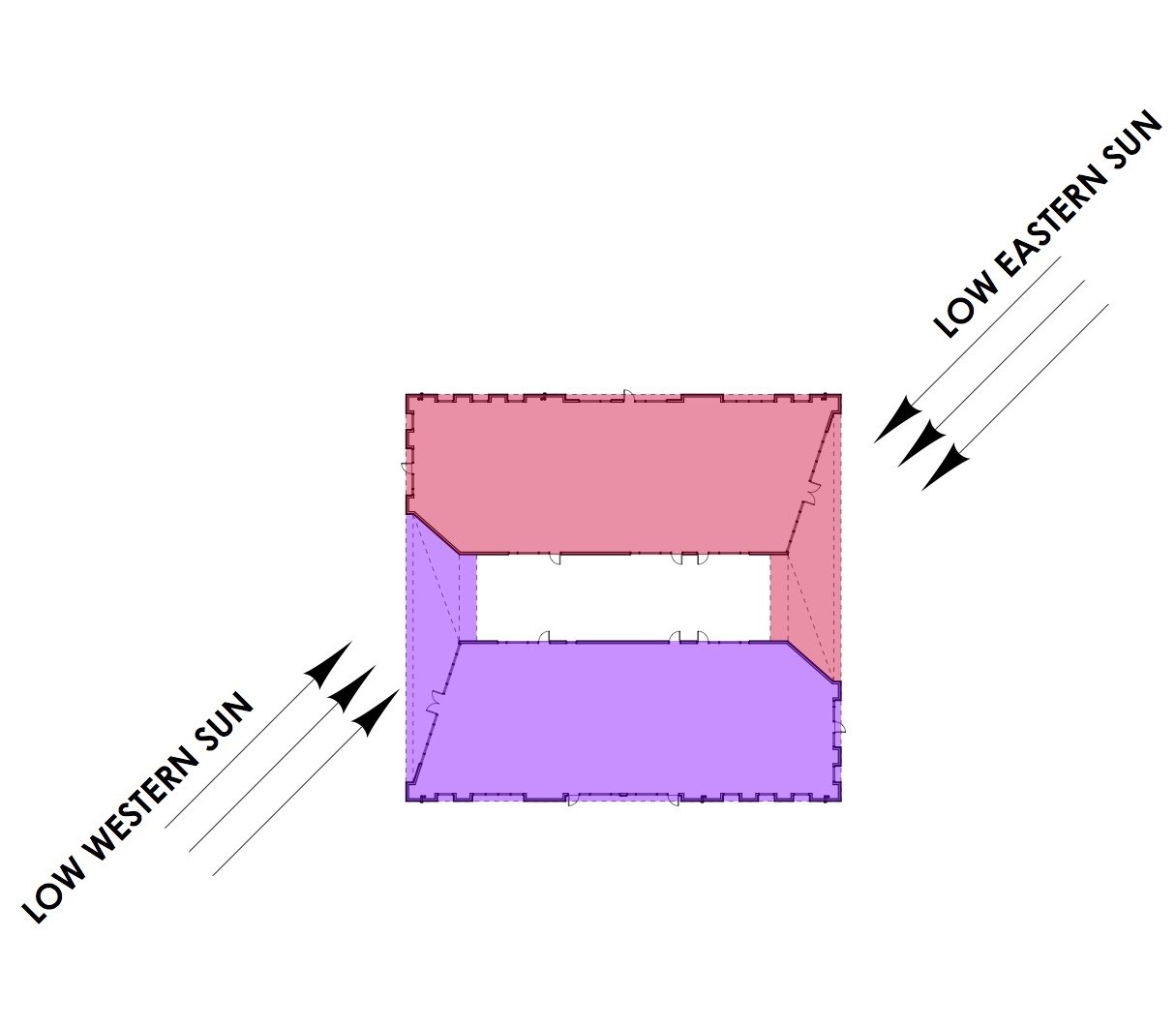
The structure's L-shaped footprint was carefully composed to wrap around the live oak, creating a visual and spatial dialogue between the built and natural environments. This configuration carves out a passive outdoor courtyard beneath the tree’s canopy, where filtered sunlight and greenery create a natural atmosphere for informal gatherings and outdoor work breaks. From nearly every interior workspace, occupants maintain a strong visual connection to this central tree — a daily reminder of the enduring presence of nature and the benefits of working in harmony with it.
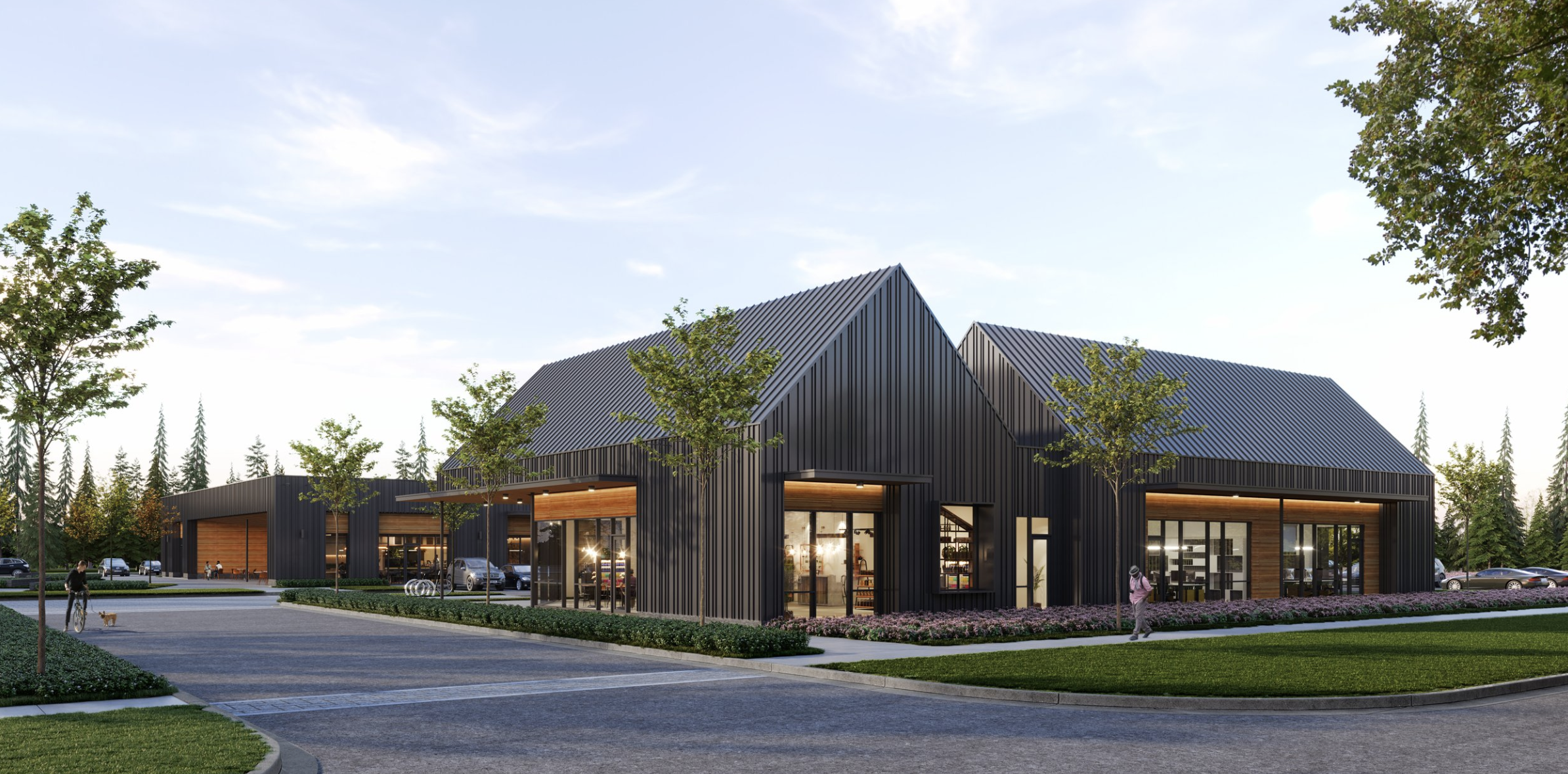
The building draws heavily on biophilic design principles, which seek to strengthen the human connection to nature through architecture. Inspired by the natural hierarchy of forest ecology, the design metaphorically treats the building as part of the understory — a supporting element to the grand canopy of the live oak. This metaphor informed everything from the structural rhythm to the material palette. Repeating brick pilasters across the façade suggest the trunks of younger trees in a grove, creating a steady cadence and grounding the building visually. Between the pilasters, chevron-patterned panels evoke the textures of bark and leaf veins, subtly referencing the intricate patterns found in the surrounding landscape.
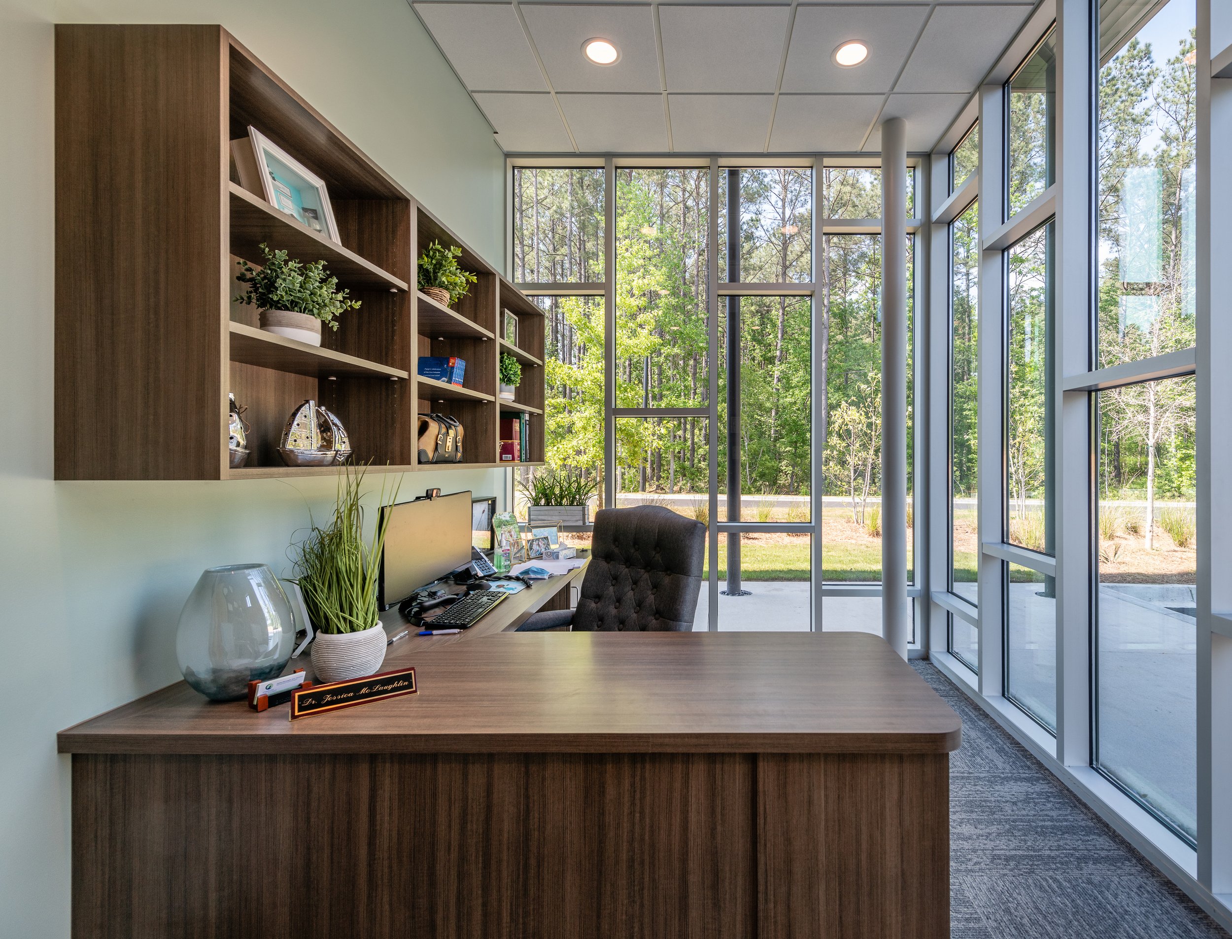
The interior design continues this natural dialogue. Expanses of glass allow daylight to flood into every office and meeting space while maintaining a visual relationship with the outdoors. Wood accents — from ceiling details to interior finishes — bring warmth and tactility to the otherwise clean-lined modern structure, further enhancing the sense of calm and comfort that biophilic spaces are known to foster. Together, these elements create a working environment that not only looks out toward nature, but also feels intrinsically connected to it. The project seeks to be a thoughtful example of how a commercial building can elevate workplace well-being while paying homage to its context.
Client: Tideline CPA
Structural: ADC Engineering
Landscape Architect: The Tomblin Company
Civil Engineer: Seabrook Engineering
Photos: Chris Smith
“Rush and Judy Dixon were a great partner for our project. In addition to great visual design, they captured details and followed up on them, adjusted design as needed to help us stay with budget and promptly addressed needs throughout the project. Rush and Judy are a talented team and at the same time approach the work with humility. We are happy to endorse them any time.” Melonie Hammond-Trace


