If you went to architecture school, you may have had that professor that liked to take your drawings or cardboard models and flip them upside down. While it may have been insulting at first, the forced change of perspective often did result in unforeseen and hidden moments of inspiration. It's amazing how often the "flip” finds its way into our daily design process. "Rotational Symmetry" is one such flipping technique that is all around us. You’ll see it in graphic & logo design, industrial design, product design, and even the occasional building. Sometimes the solution is purely aesthetic and symbolic: think of the Yin & Yang symbol or the Recycling logo, each element wrapping around itself. Sometimes the solution is purely functional: think of the repeated blades of a wind turbine or the cogs of a gear. We find the notion of repeating a single component in a not-so-obvious way to create whole new forms, geometries, or spaces to be endlessly fascinating.
Examples of Rotational Symmetry in Architecture:
Symmetry and balance have been revered as architectural tenets for centuries, going back to Vitruvius’s Ten Books on Architecture circa 1st century Rome and before. When people say something has symmetry, they are usually referencing the use of an implied “Line of Symmetry” where each side of the object is a mirror to the other. Rotational symmetry goes one step further with repeating a form or mass around a fixed point. Intrigued by the notion of ‘complexity within simplicity’ and creating a measured dynamic, we studied historical precedents that inspired many of our recent designs.
DAYFIELD PARK
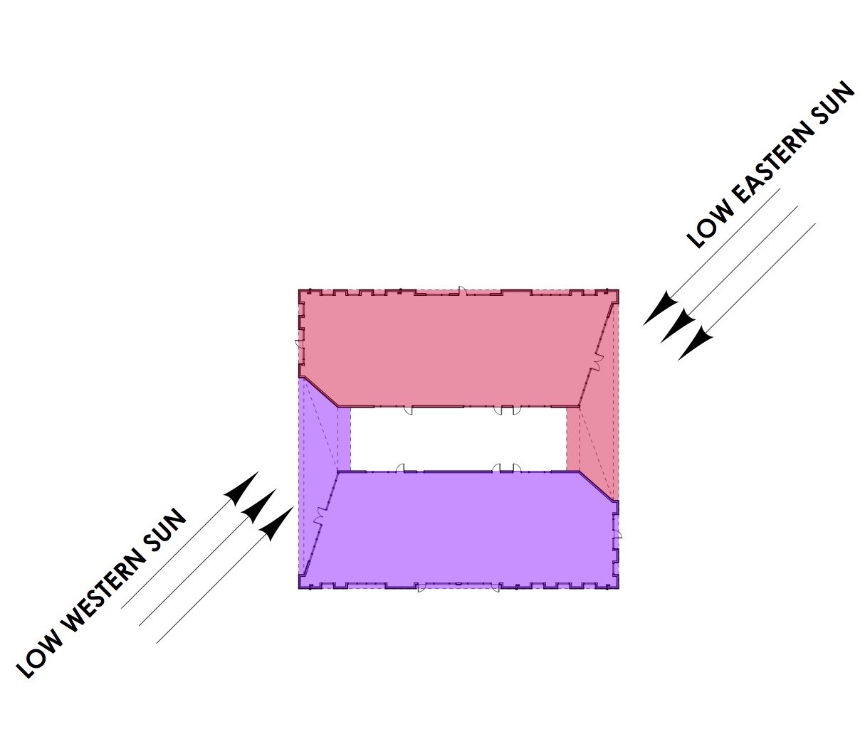
The design approach for Building B at Dayfield Park, a soon to be commercial destination in the award-winning Nexton Community, is rooted in strong massing, innovative detailing and creating an inspiring place to work and do business. The program included providing space for offices and retail tenants in a single story building while creating a unique and modern business park that engaged with adjacent green spaces and supported the current day work place expectations. The resulting design used rotational symmetry to leverage the square footprint by creating a central courtyard and through two overhead ‘thresholds’. The dynamic suggestion is amplified by angled walls and highly textured surfaces. Click here for more about the project.
RDA’S SUBMISSION FOR THE NORTH CHARLESTON FLAG
Earlier this year, the City of North Charleston launched a public design competition to select a new City flag. One of the symbols used in our submission was a reference to Park Circle (a derivative of a Garden City urban plan). By deconstructing the graphic and using rotational symmetry, we were able to invoke dynamics as if in rotating motion. Click here for more on our flag design.
CAMP HALL PARK PAVILION
Santee Cooper’s Camp Hall is a next generation commerce park where “people, nature and productivity connect.” With state-of-the-art manufacturing in a setting of vast natural beauty, the design concept of “Nature and the Machine” permeates the built environment. Like the vehicles and machines produced in Camp Hall, the Architecture is intended to embody precision, sleekness and innovation. The building forms are abstract interpretations of the patterns, colors, and figures found in nature. Specifically, the Park Pavilion uses rotational symmetry to create a subtle dynamic-ness of the roof planes. Click here for more on the project.
FIREFLY DISTILLERY GIFT SHOP FIXTURES
Part of our scope when we were designing Firefly Distillery’s new facility in North Charleston, SC was to carry the building’s design concepts to the gift shop merchandise fixtures. Using barrel lids, steel pipes, and rotational symmetry, a simple solution was created.


