During the first design meeting with the Owner’s of Sweetgrass Pharmacy, we discussed the architecture of the building reinforcing their existing pharmacy brand, the use of natural looking materials to provide a warm and welcoming building and the desire for a forward-looking, modern building to match the innovation that happens in their compounding lab. The property fronts Park Avenue Boulevard in Carolina Park, Mount Pleasant, which allowed for the building to hold a strong street presence with the main customer entrance, a take on the corner store entry, near the parking and drive-through lane. Materials were chosen for their warmth, texture and durability, and include Meridian Brick “Magnolia Bay” in queen size, Nichiha Vintage Wood siding in a cedar tone and Hardie Artisan V-Groove siding.
Camp Hall Village Park Pavilions
It’s coming up on two years since Rush Dixon Architects was selected as the architect and designer for Santee Cooper’s Camp Hall Village Center; since then we have helped imagine the masterplan layout, phasing approach and concept architecture for the future buildings of this “next generation commerce park.” The overarching design concept of “Nature + Machine” marries the manufacturing nature of Camp Hall’s partners (looking at your Volvo SC) with the surrounding natural preserves.
With state-of-the-art manufacturing in a setting of vast natural beauty, the design concept of “Nature and the Machine” permeates the built environment. Like the vehicles and machines produced in Camp Hall, the Architecture is intended to embody precision, sleekness, and innovation.
With bird protection and awareness as a major focus for Camp Hall, the Architecture likewise found its inspiration. The building forms are abstract interpretations of the patterns, colors, and figures found in native species. The “Avian Pavilion” hovers over the lake greeting visitors with outspread wings, encouraging visitors to take refuge from the sun, birdwatch, and learn more about Camp Hall’s mission. [Camp Hall website]
Click here for a video prepare by Seamon Whiteside capturing our building designs for the village center: https://youtu.be/utZ-tb50I-Q
The first structures out of the ground will be open-air pavilions located in the Camp Hall Village park. The programmatic function is to provide gathering areas, places for viewing passive play areas as well as recreational courts and fields. The architectural design language will be established in this first phase through sculptural forms articulated with geometric framework and clad in a manner that harkens to patterns found in nature. The park pavilions act as pieces of sculpture in the landscape. Origami was also an influence as demonstrated in the Main Park Pavilion ‘folded’ roof form. Collaborators ADC Engineering (structural engineering), DWG Engineering (electrical engineering), Seamon Whiteside (landscape architecture) and Choate Construction (general contractor) have proven once again to be great company to keep in bringing the first structures to life. Stay tuned for construction updates and future events.
Firefly Distillery | Good Times. Great Spirits.
When we began the design for Firefly Distillery’s new facility, the first step was to visit their existing distillery and tasting room on Wadmalaw Island, SC to learn their history, better understand their brand, see their process, and sample some spirits. (Spoiler alert: they’re good.) Before putting pen to paper, it was important for us to know how Firefly started, where they are going, how they differentiated themselves in the industry and thus what functional spaces and visitor experiences to help create within the architecture.
The next couple of years included distillery research (see our Distillery Homework blog), design iterations and construction. The new facility opened in February 2020 and enjoyed a few weeks of hosting a record breaking number of visitors before the pandemic dialed down indoor gatherings. Firefly was able to pivot their distilling efforts to produce hand sanitizer to meet the moment and are now able to safely host visitors at the outdoor courtyard, tastings on the porch and socially distanced outdoor concerts.
Highlights of our research and how it dovetailed into our design
Firefly is a locally owned, family business who was one of the South Carolina Lowcountry’s best kept secrets until their inspired collaboration with the neighboring Charleston Tea Garden yielded ‘Firefly Sweet Tea Vodka’. Ever since, they have enjoyed a national audience and are a destination for tours, tastings and events. Therefore the building program included a gift shop, distillery, bottling line, lab, a tasting room, spirits retail section and multiple places for events (weddings, receptions, smaller meetings and outdoor concerts.)
The Firefly brand is southern, approachable, and laid back in the best way possible; think sitting on your porch with a drink in your hand, friends nearby and bluegrass playing in the background. This told us that while this will be a brand new, code-compliant facility, there should be moments of patina and casualness. Specialty craftspeople really brought the ‘soul’ into this new building. Shout out to coppersmiths, Khalima Lights for their handmade light fixtures, Limelight for the signage installation, Gil Shuler for the branding graphics and Lowcountry Case + Millwork for sourcing the reclaimed wood and executing our barrel stave design.
The Firefly folks, while innovative and forward-thinking, are also nostalgic and rustic with a side order of DIY. This inspired us to deconstruct wooden bourbon barrels in the back of our studio and incorporate them into the bar and light fixture designs as well as source reclaimed wood for paneling and metal roofing from a former Firefly structure as an interior accents.
We don’t know much, but we do know how to keep good company. See below for some of the all-star collaborators and craftspeople:
Seamon Whiteside: Civil Engineering + Landscape Architecture
ADC Engineering: Structural Engineering
Charleston Engineering: Mechanical, Plumbing, Electrical, Fire Protection Engineering
Dalkita: Distillery Consultant
Trident Construction: General Contractor
Gil Shuler: Graphic Design + Branding
Limelight Custom Sign Company: Signage
Khalima Lights: hand-made specialty lighting
Lowcountry Case + Millwork: interior millwork including tasting bars, spirits retail display, reclaimed wood paneling and barrel stave details.
Chris Smith Photography: All photographs
Charleston Modern Infill - UPDATE
This speculative infill development included three single family residences located in the Cannonborough neighborhood in downtown Charleston. The client’s desire for a modern aesthetic with durable, low maintenance materials was executed with cementitious V-groove and lap siding on a stucco base. Now two of the three residences have been completed by Zourzoukis Homes and are for sale.
Click HERE for a link to the listing and additional photos by our friends at Birchin Lane Realty.
15 Years | Rush Dixon Architects
As we mark our 15th year in business, we wanted to thank all of our clients, colleagues and mentors for being a part of our story. We consider it a great privilege and responsibility to design for our community and neighbors. In honor of this and in recognition of the opportunities we have been given, we have made a donation to each of these local non-profit clients; please check out their missions and programs if you are considering supporting the Charleston community.
One80 Place
Mission: Ending and Preventing Homelessness
35 Walnut Street, Charleston, SC 29403
Click here for their website.
Their mission to end and prevent homelessness in Charleston with a vision where everyone is housed. In 1984, community leaders came together to start a shelter to help the growing number of people who were homeless. Over three decades later, what started as a small effort to address an emergency need grew to be largest provider of homelessness services in Charleston. “While we are bigger than we used to be, we are local, regionally focused, and cater to our clients one person at a time, one family at a time.” Since the start of the pandemic, 134 individuals (including children, women, men and Veterans) have been moved into homes of their own. In addition, One80 Place tested all of the staff and clients in the shelter last month with everyone testing negative - a satisfying demonstration of their social distancing and sanitation protocols at work.
Dee Norton Child Advocacy Center
Mission: Prevent Abuse, Protect Children and Heal Families.
1061 King Street Charleston, SC 29403
Click here for their website.
Child abuse does not define who a child is or who they will become. At the Dee Norton Child Advocacy Center, children and families have a safe, child-friendly place to turn when there is a concern about abuse. Primary services include providing immediate support and assistance to children and their families through forensic interviews, medical examinations and mental health assessments. Dee Norton also provides therapy to child victims and their families where appropriate. Dee Norton is a community-based, 501(c)(3) non-profit organization, and coordinates with more than 30 partner agencies in the Charleston community to take appropriate action and deliver the critical services needed for the child and family. Since 1991, Dee Norton has helped over 29,000 children and their families.
East Cooper Community Outreach
Providing safety net services to our low income neighbors, while empowering them to create a better future for themselves, their families, and our communities.
1145 Six Mile Road Mount Pleasant, SC 29466
Click here for additional information on their website.
Founded as an emergency relief effort in 1989 after the devastation from Hurricane Hugo, East Cooper Community Outreach (ECCO) has since grown into a permanent resource for the community in need with three main program areas: Basic Needs, Health Services and Empowerment. Thousands of families a year receive emergency assistance for food, clothing, household furnishings, financial aid, and have access to dental care, medical care, prescription assistance, counseling, and educational opportunities like financial literacy classes, computer skills training, job readiness workshops. These services are all enhanced through personal interaction with staff who provide individualized support for each client, ongoing case management, and emphasize accountability and achievement.
Product Design by Architects
Attending architecture school is often regarded as the foundation for establishing a rigorous design process. This can then be applied not only to designing buildings, but other disciplines of varying scales such as urban design, graphic design, furniture design or in Rush’s case, product design. We have always drawn inspiration from architects who toggle between such scales or disciplines. Some of our favorites include:
Aldo Rossi (1931 - 1997)
An Italian architect and leader of the postmodern movement, Rossi was known for built works of architecture, theory, drawing and product design. We first saw his “Il Conico" tea kettle and “La Conica" espresso coffee maker for Alessi and knew it was no ordinary design.
Charles-Edouard Jeanneret (1887 - 1965)
“Le Corbusier” as he was known as, was an architect, designer, painter, urban planner and writer. Notable works of architecture include the Villa Savoye and the Ronchamp chapel and collaborations with his cousin, Pierre Jeanneret, led to several iconic pieces of modern furniture that we have all likely seen, such as the sling chair.
Philippe Starck (1949)
French architect, Philippe Starck is known for cultural venues and hotels, also designed yachts and furniture. The iconic juicer is our favorite.
Rush3 Product Design Studio
Truth be told, a slow economy, a goal set 10 years prior, and a chance encounter with a vintage bottle opener led to the creation of Rush3 Product Design Studio in 2011. Local branding company Slant Media made the process of starting a product design company including logo creation, web site development and product branding fun and extremely exciting. The next several years were a mixture of architecture and product design - using the design process to jump scales and functions. Some highlights of the Rush3 Product Design Studio chapter…
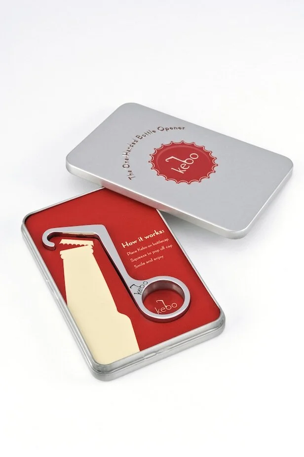
Kebo® - One Handed Bottle Opener
Inspired by the Theodore Low bottle opener from the 1930s, the Kebo Bottle Opener is a modern interpretation that offered better seamless function and classic styling. It was cast of stainless steel and polished to a mirror finish because it needed to feel good in your hand and be a sculptural if not architectural piece. The “Kebo®, short for “bottle key”, won the Innovation Award in the ‘Handtools and Cutlery’ category at the 2012 International Home and Housewares Show. Fun times were had in research and development (yes, we drank a lot of beer) as well as press in Men’s Journal, Core 77, Buzzfeed, Fast Company and the Today Show. Kebo was sold at many local shops, small businesses and even Restoration Hardware and the Museum of Modern Art.
Kebo Light
Anyone in the product industry knows that before long, knock-offs sprout up. At first when a colleague suggested we do our “own knock-off” we thought it impossible to consider anything other than the pure, stainless steel original Kebo. But when attending industry trade shows we were shocked to see derivations of last show’s newest products be presented as their own fresh ideas. It’s rough out there even with trademarks and patents in place. Enter “Kebo LIght.” A different iteration of the original Kebo with a nod to light beer. It was lightweight (made from aluminum) and available in colors so this captured a lower price point and more of an impulse buy - a bottle opener you would have on the boat or at tailgates.
Munch Stix®
One night when having take-out Chinese for dinner, our then 7 year old asked for chopsticks but mispronounced them saying “chomp” instead. This was a good chuckle, but then we said, what if chopsticks could actually chomp. After initial launch, a bit of a trademark hiccup had us re-brand to “Munch Stix.” We still had fun with “Chum” the shark, “Al” the alligator and “Teri” the Pterodactyl as kid-friendly chopsticks. These were a finalist for the 2013 International Housewares Association Innovation Award (Tabletop category) and made the rounds on mom-blogs including Cool Mom Picks and A-List Mom. Retailers included kitchen and toy shops as well as the Museum of Natural History and the Georgia Aquarium.
Tre™ Bottle Opener
Returning to the bottle opener space (because beer) the last product Rush3 Studio designed and produced was a sculptural triple function beer opener crafted and contoured for 1) twist-off bottles, 2) pry-off bottles and 3) can tabs. We did a small run of these in 2017 mainly for client gifts and local sales.
Certainly a great education not only in jumping design scales and function from buildings to housewares, but in dipping our toes in the product / retail sector. We have since dialed down the product design studio for now and have been focusing on architecture in the Charleston metro area. Though we still enjoy designing at a range of scales and are life-long fans of modern product design.
The New Old House: Historic + Modern Architecture Combined
Practicing architecture in the history-rich Charleston metro area often has us thinking about how new buildings or additions should interact with historic ones - the coexistence of present and past. Marc Kristal tackles the dialogue in his book, “The New Old House” with eighteen built examples of homes that combine historic and modern architecture. This discussion becomes one of preservation (sometimes with a flexible approach), function, aesthetics, respect and sustainability.
“As reusing an existing structure is one of the “greenest” of building practices, finding effective strategies for so doing contributes to the global drive for sustainability. The preservation of buildings for their larger historic value also means that locations…that are rich in meaning can retain their influence…” Marc Kristal
Well known institutional examples, including Carlo Scarpa’s Museo di Castelvecchio and I.M. Pei’s Grand Louvre addition, tee up the narrative of combining historic and contemporary work. No doubt there exists a sliding scale of what is too precious to alter, preserve vs. repair, how far is too far a departure in terms of style, etc. We lean toward those designs that contrast the original so it is very clear what is historic and what is new, as long as the addition is honest, well-designed, detailed and executed, especially if the addition enables the structure to have another relevant chapter.
As Gil Schafer III offers in the foreword, “Some of the most interesting conversations occur when there are opposing points of view - as long as they are undertaken with intelligence and civility.”
The Offices at Belle Hall
Commercial office design doesn’t often start with details; it begins with big picture math - proformas, core factors, totals of leasable space, parking calcs, etc. While all of these formulas came into play early and often during the design of this speculative office building, we were able to focus equally on the small design moments that seek to make a building and space unique.