Paul R. Williams Student Scholarship

[07.01.22 UPDATE: We have just been notified that this scholarship is no long an active program. Please consider supporting or participating in the National Organization of Minority Architects’ HBCU Professional Development Program instead.]

We are life-long learners. As architects, we are always seeking a greater understanding of design precedents, building science, context and history to inform our work. We bring an open mind to each client, project and opportunity. As entrepreneurs and small business owners, we understand the highs and lows of the journey, the grind and hustle involved. We also understand that the opportunities we have been given, as a white woman and a white man, are not universally given. And while we look at the world with empathy and optimism, we now understand that all of this is not enough.

It is not enough when our industry does not reflect the diversity of our country’s population. It is not enough when only 2% of licensed architects in the AIA (American Institute of Architects) are African American. It is not enough when only 0.3% of licensed architects are women of color.

From Alice Liao’s “Diversity in Architecture” piece for Architect Magazine (May 2019) “According to the Census Bureau, the U.S. population is 61 percent white, 13 percent African American, 18 percent Hispanic or Latinx, 6 percent Asian, and 1 percent Native American. Meanwhile, the makeup of AIA members is 67 percent white, 2 percent African American, 5 percent Hispanic or Latinx, 6 percent Asian, and less than 1 percent Native American, with 18 percent not reporting.” This first article in her three part series pinpoints barriers to entry including cognizance of the architecture profession, money and biases (both latent and expressed).

It is a fact that the more diverse the room is, the better the outcome. It is important for any workforce to reflect the population they are serving. Specific to the architectural industry, having designers who represent the building users and people who work, love and play in that community is the only way to truly create an inspired and relevant built environment for every person.

We started thinking about how to increase the diversity and equity in the architectural profession and looked toward scholarship opportunities for persons of color. That led us to DesignClass’ Paul R. Williams Student Scholarship. In their words, “Paul Williams kicked off a prolific career by becoming the first licensed African-American member of the AIA in 1923. Throughout his life he designed over 2,000 buildings in California and helped shape Los Angeles into the metropolitan city it is today. In 1957, Williams became the first African-American elected as a Fellow of the AIA. DesignClass honors the legacy of Paul R. Williams with a scholarship for African-American architecture students seeking to foster curious and creative confidence in their communities.” The scholarship provides financial assistance to African American students studying at a NAAB accredited architecture program. [More to come on Mr. Williams’ work in a future blog.]

Please help spread the word, consider contributing to this scholarship fund and sharing other ways that the veterans of our profession can help the industry to achieve true racial equity. As always, we are works in progress and welcome any and all lessons we have yet to learn.

“Talent is universal but opportunity is not.”

Kennedy Odede

Product Design by Architects

Attending architecture school is often regarded as the foundation for establishing a rigorous design process. This can then be applied not only to designing buildings, but other disciplines of varying scales such as urban design, graphic design, furniture design or in Rush’s case, product design. We have always drawn inspiration from architects who toggle between such scales or disciplines. Some of our favorites include:

Aldo Rossi (1931 - 1997) 

An Italian architect and leader of the postmodern movement, Rossi was known for built works of architecture, theory, drawing and product design. We first saw his “Il Conico" tea kettle and “La Conica" espresso coffee maker for Alessi and knew it was no ordinary design.  

Charles-Edouard Jeanneret (1887 - 1965) 

“Le Corbusier” as he was known as, was an architect, designer, painter, urban planner and writer. Notable works of architecture include the Villa Savoye and the Ronchamp chapel and collaborations with his cousin, Pierre Jeanneret, led to several iconic pieces of modern furniture that we have all likely seen, such as the sling chair. 

Philippe Starck (1949) 

French architect, Philippe Starck is known for cultural venues and hotels, also designed yachts and furniture. The iconic juicer is our favorite.

Rush3 Product Design Studio

Truth be told, a slow economy, a goal set 10 years prior, and a chance encounter with a vintage bottle opener led to the creation of Rush3 Product Design Studio in 2011.  Local branding company Slant Media made the process of starting a product design company including logo creation, web site development and product branding fun and extremely exciting.  The next several years were a mixture of architecture and product design - using the design process to jump scales and functions. Some highlights of the Rush3 Product Design Studio chapter…

Kebo® - One Handed Bottle Opener

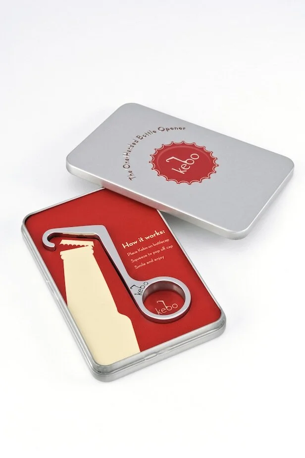
Inspired by the Theodore Low bottle opener from the 1930s, the Kebo Bottle Opener is a modern interpretation that offered better seamless function and classic styling. It was cast of stainless steel and polished to a mirror finish because it needed to feel good in your hand and be a sculptural if not architectural piece. The “Kebo®, short for “bottle key”, won the Innovation Award in the ‘Handtools and Cutlery’ category at the 2012 International Home and Housewares Show. Fun times were had in research and development (yes, we drank a lot of beer) as well as press in Men’s Journal, Core 77, Buzzfeed, Fast Company and the Today Show. Kebo was sold at many local shops, small businesses and even Restoration Hardware and the Museum of Modern Art.

Kebo® The One Handed Bottle Opener is a 2012 International Home and Housewares Show Innovation Award winner, was featured on The Today Show and was named as one of Men’s Journal’s “Perfect Things”

Kebo® The One Handed Bottle Opener is a 2012 International Home and Housewares Show Innovation Award winner, was featured on The Today Show and was named as one of Men’s Journal’s “Perfect Things”

Kebo Light

Anyone in the product industry knows that before long, knock-offs sprout up.  At first when a colleague suggested we do our “own knock-off” we thought it impossible to consider anything other than the pure, stainless steel original Kebo. But when attending industry trade shows we were shocked to see derivations of last show’s newest products be presented as their own fresh ideas. It’s rough out there even with trademarks and patents in place. Enter “Kebo LIght.” A different iteration of the original Kebo with a nod to light beer.  It was lightweight (made from aluminum) and available in colors so this captured a lower price point and more of an impulse buy - a bottle opener you would have on the boat or at tailgates.  

Kebo® Light offers the same elegant design extruded from lightweight aluminum making it perfect for picnics, a day at the beach or any time on-the-go.

Kebo® Light offers the same elegant design extruded from lightweight aluminum making it perfect for picnics, a day at the beach or any time on-the-go.

Munch Stix®

One night when having take-out Chinese for dinner, our then 7 year old asked for chopsticks but mispronounced them saying “chomp” instead. This was a good chuckle, but then we said, what if chopsticks could actually chomp. After initial launch, a bit of a trademark hiccup had us re-brand to “Munch Stix.” We still had fun with “Chum” the shark, “Al” the alligator and “Teri” the Pterodactyl as kid-friendly chopsticks. These were a finalist for the 2013 International Housewares Association Innovation Award (Tabletop category) and made the rounds on mom-blogs including Cool Mom Picks and A-List Mom.  Retailers included kitchen and toy shops as well as the Museum of Natural History and the Georgia Aquarium. 

Munch Stix® are child-friendly chopsticks that all have mouths and munch! Made in the USA, Munch Stix® are an AmericasMart ICON Honors Innovation Award finalist, an Editor's Pick for The Gourmet Retailer and one of A-List Mom's "Toy of the Year" in …

Munch Stix® are child-friendly chopsticks that all have mouths and munch! Made in the USA, Munch Stix® are an AmericasMart ICON Honors Innovation Award finalist, an Editor's Pick for The Gourmet Retailer and one of A-List Mom's "Toy of the Year" in 2014. Meet "Chum the Shark" who has also been endorsed by pediatric Occupational Therapist, Lindsey Biel OTR/L.

"Al the Alligator" Munch Stix® was featured in Sharon Garofalow's "Cupcakes and Cutlery" blog and named, along with his sibllings, as a 2015 Family Choice Award Winner.

"Al the Alligator" Munch Stix® was featured in Sharon Garofalow's "Cupcakes and Cutlery" blog and named, along with his sibllings, as a 2015 Family Choice Award Winner.

"Teri the Pterodactyl" Munch Stix® was the cover girl for Fancy Food & Culinary Products Magazine in June of 2013.

"Teri the Pterodactyl" Munch Stix® was the cover girl for Fancy Food & Culinary Products Magazine in June of 2013.

Tre™ Bottle Opener

Returning to the bottle opener space (because beer) the last product Rush3 Studio designed and produced was a sculptural triple function beer opener crafted and contoured for 1) twist-off bottles, 2) pry-off bottles and 3) can tabs. We did a small run of these in 2017 mainly for client gifts and local sales. 

Released in November of 2017, TRE is a triple-function bottle opener crafted and contoured out of stainless steel for twist-off bottles, pry-off bottles and can tabs.

Released in November of 2017, TRE is a triple-function bottle opener crafted and contoured out of stainless steel for twist-off bottles, pry-off bottles and can tabs.


Certainly a great education not only in jumping design scales and function from buildings to housewares, but in dipping our toes in the product / retail sector. We have since dialed down the product design studio for now and have been focusing on architecture in the Charleston metro area. Though we still enjoy designing at a range of scales and are life-long fans of modern product design. 

Stono River Residence

With an affinity for mid-century modern architecture the clients for the Stono River Residence introduced us to their goals for a new house that would sit on the banks of the Stono River. The resulting design is a study of solid planes contrasting with light and transparency. The main living spaces for the couple are arranged on the ground floor with guest rooms above the garage wing for privacy. Materials include stucco for main organizing walls, cementitious siding and cypress soffits and lattice privacy walls.

Rendered view looking at the front elevation shows the house’s transparency, mono-slope roof and entrance canopy. Garage wing with latticed wall on left.

Rendered view looking at the front elevation shows the house’s transparency, mono-slope roof and entrance canopy. Garage wing with latticed wall on left.

Front entrance sequence

Front entrance sequence

Interior rendering of the main living space looking from the kitchen toward the living area.

Interior rendering of the main living space looking from the kitchen toward the living area.

Rendered view of the rear patio of the Stono River Residence in Charleston, SC showing transparency from main living area, cypress soffits and stucco organizing wall.

Rendered view of the rear patio of the Stono River Residence in Charleston, SC showing transparency from main living area, cypress soffits and stucco organizing wall.

Even on a cloudy day, the Stono River in Charleston is captivating.

Even on a cloudy day, the Stono River in Charleston is captivating.

Eldridge Street Synagogue

IMG_9047.jpg

In a recent design inspiration trip to New York City, a last minute tour became the true highlight. As always, the trip included many hours walking the NYC streets, studying facades and building details, meandering through the Metropolitan Museum of Art, and if I’m being honest, eating bagels. The agenda also included the Tenement Museum where you can select from various behind-the-scenes tours to better understand tenement and immigrant life in the 1800 and 1900s. As a descendant of Sicilian immigrants (this is Judy talking) who arrived and settled in NY, I have long been intrigued with the hardships, courage, and work ethic of my grandparents and others who left everything in search of a better life. It was there when the Eldridge Street Synagogue, a landmark synagogue from 1887 and just a few blocks away, was suggested as a follow-up tour.

The docent shared that the Eldridge Street Synagogue was likely the first house of worship built for Jewish immigrants from Eastern Europe in America. It was designed by the Herter Brothers who were also the architects of several nearby tenement buildings (the better ones) and was their first synagogue. The building was embraced and well-used for decades until its members began moving out of the neighborhood; synagogues are located in the same neighborhood so members can walk to worship on the Sabbath. This shift in the neighborhood sadly resulted in the worship space being closed off (a smaller subset still worshipped in the lower level) and it subsequently fell into disrepair. During the 1980s, the Eldridge Street Project formed to stabilize and restore the structure. After 20 years and $20 million, it became a National Historic Landmark and working museum.

IMG_2029.jpg

Architecturally, the barrel vaulted space is striking, if not surprising, with Moorish detailing, gold and blue hues , stained glass and pendant light fixtures. The construction budget was tight yet the direction from the client was to make it ornate. To that end, no wall was left unadorned including painting the columns to look like marble. The pews were perhaps a result of value engineering as they are from a catalogue and harken to Christian trinity symbolism. No matter, the design moment that solidifies the story for me is the stunning rose window above the ark. It is the only contemporary design element in the space since the original window was destroyed. I am always a fan of the meaningful and graceful juxtaposition of ‘new and old’. As the museum website describes, “A final crowning element was the addition of a monumental stained-glass rose window by artist Kiki Smith and architect Deborah Gans in 2010. This beautiful sacred artwork is the only contemporary element in the main sanctuary. It marks the revitalization of the building in the 21st century, the most recent chapter in a story that is ever evolving.” The poignancy, symbolism and beauty is best described by the designers themselves; click here for a more in-depth explanation.

IMG_8833.jpg

For something that almost didn’t happen, touring the Museum at Eldridge Street has become a favorite lesson of mine as it tells a story of architecture, historic preservation, immigrants and the power of community.

*****

[Back to neighborhoods ebbing and flowing, while the building was originally located in the heart of the Jewish Lower East Side it is now part of Chinatown. The building exterior was hard to fully absorb because the Chinese New Year parade was simultaneously happening outside which I am not sad about…]