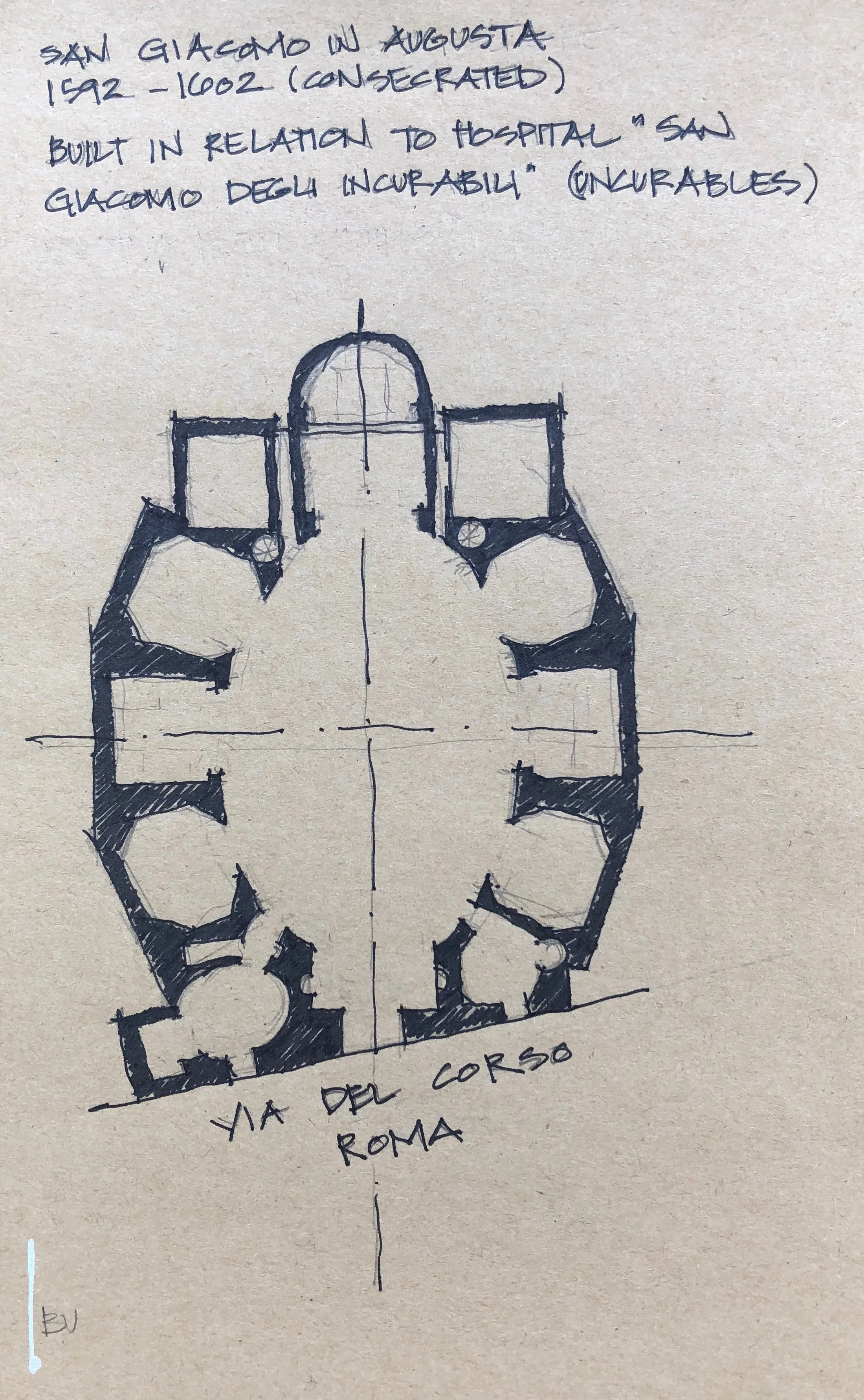
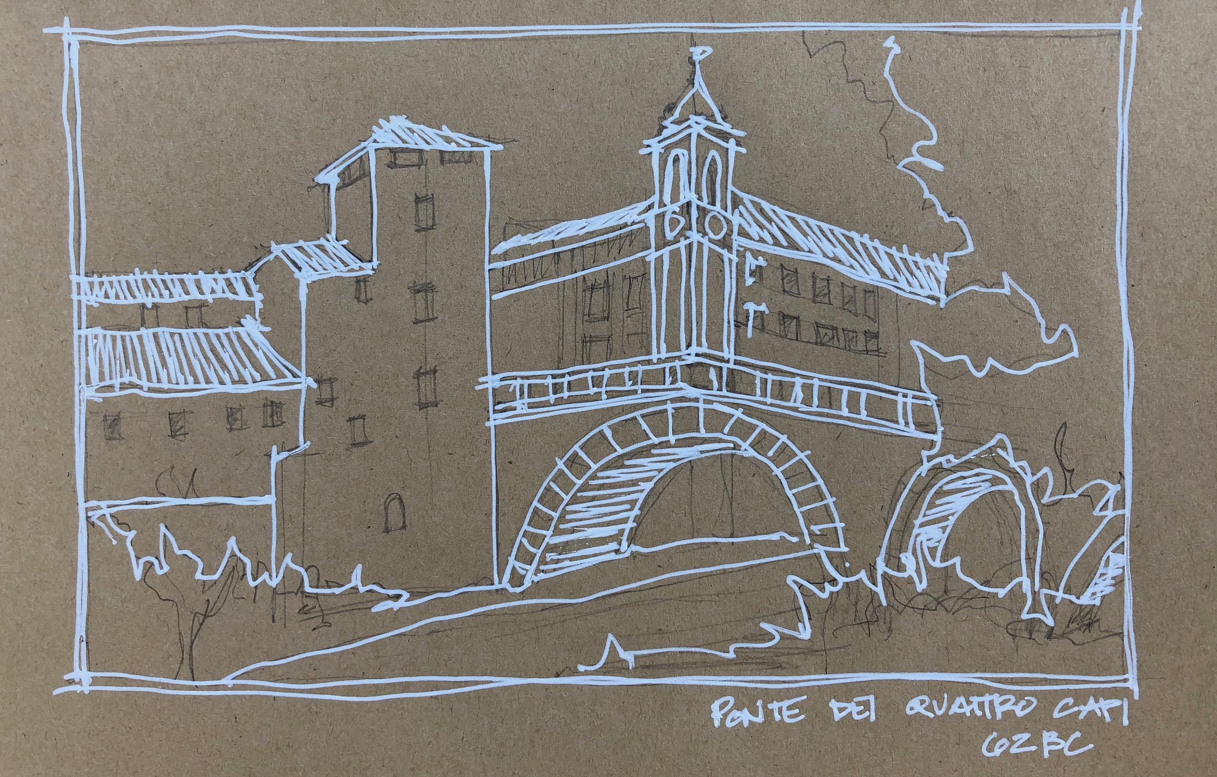
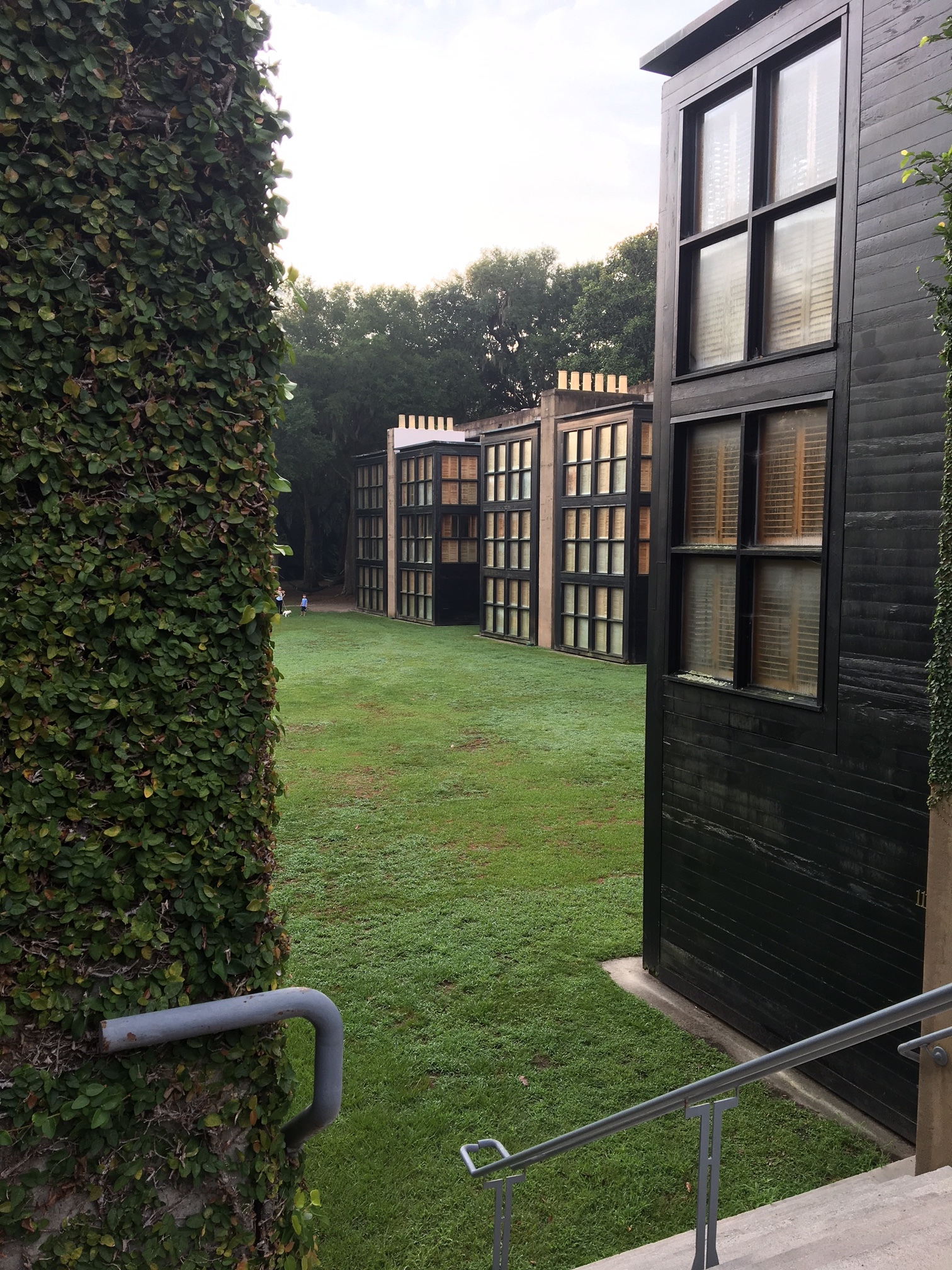
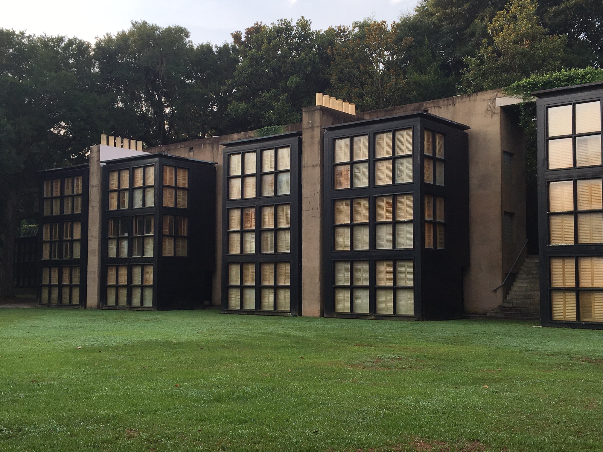
Attending architecture school is often regarded as the foundation for establishing a rigorous design process. This can then be applied not only to designing buildings, but other disciplines of varying scales such as urban design, graphic design, furniture design or in Rush’s case, product design. We have always drawn inspiration from architects who toggle between such scales or disciplines. Some of our favorites include:
Aldo Rossi (1931 - 1997)
An Italian architect and leader of the postmodern movement, Rossi was known for built works of architecture, theory, drawing and product design. We first saw his “Il Conico" tea kettle and “La Conica" espresso coffee maker for Alessi and knew it was no ordinary design.
Charles-Edouard Jeanneret (1887 - 1965)
“Le Corbusier” as he was known as, was an architect, designer, painter, urban planner and writer. Notable works of architecture include the Villa Savoye and the Ronchamp chapel and collaborations with his cousin, Pierre Jeanneret, led to several iconic pieces of modern furniture that we have all likely seen, such as the sling chair.
Philippe Starck (1949)
French architect, Philippe Starck is known for cultural venues and hotels, also designed yachts and furniture. The iconic juicer is our favorite.
Rush3 Product Design Studio
Truth be told, a slow economy, a goal set 10 years prior, and a chance encounter with a vintage bottle opener led to the creation of Rush3 Product Design Studio in 2011. Local branding company Slant Media made the process of starting a product design company including logo creation, web site development and product branding fun and extremely exciting. The next several years were a mixture of architecture and product design - using the design process to jump scales and functions. Some highlights of the Rush3 Product Design Studio chapter…
Kebo® - One Handed Bottle Opener
Inspired by the Theodore Low bottle opener from the 1930s, the Kebo Bottle Opener is a modern interpretation that offered better seamless function and classic styling. It was cast of stainless steel and polished to a mirror finish because it needed to feel good in your hand and be a sculptural if not architectural piece. The “Kebo®, short for “bottle key”, won the Innovation Award in the ‘Handtools and Cutlery’ category at the 2012 International Home and Housewares Show. Fun times were had in research and development (yes, we drank a lot of beer) as well as press in Men’s Journal, Core 77, Buzzfeed, Fast Company and the Today Show. Kebo was sold at many local shops, small businesses and even Restoration Hardware and the Museum of Modern Art.
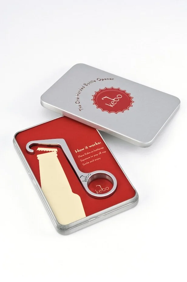
Kebo® The One Handed Bottle Opener is a 2012 International Home and Housewares Show Innovation Award winner, was featured on The Today Show and was named as one of Men’s Journal’s “Perfect Things”
Kebo Light
Anyone in the product industry knows that before long, knock-offs sprout up. At first when a colleague suggested we do our “own knock-off” we thought it impossible to consider anything other than the pure, stainless steel original Kebo. But when attending industry trade shows we were shocked to see derivations of last show’s newest products be presented as their own fresh ideas. It’s rough out there even with trademarks and patents in place. Enter “Kebo LIght.” A different iteration of the original Kebo with a nod to light beer. It was lightweight (made from aluminum) and available in colors so this captured a lower price point and more of an impulse buy - a bottle opener you would have on the boat or at tailgates.

Kebo® Light offers the same elegant design extruded from lightweight aluminum making it perfect for picnics, a day at the beach or any time on-the-go.
Munch Stix®
One night when having take-out Chinese for dinner, our then 7 year old asked for chopsticks but mispronounced them saying “chomp” instead. This was a good chuckle, but then we said, what if chopsticks could actually chomp. After initial launch, a bit of a trademark hiccup had us re-brand to “Munch Stix.” We still had fun with “Chum” the shark, “Al” the alligator and “Teri” the Pterodactyl as kid-friendly chopsticks. These were a finalist for the 2013 International Housewares Association Innovation Award (Tabletop category) and made the rounds on mom-blogs including Cool Mom Picks and A-List Mom. Retailers included kitchen and toy shops as well as the Museum of Natural History and the Georgia Aquarium.

Munch Stix® are child-friendly chopsticks that all have mouths and munch! Made in the USA, Munch Stix® are an AmericasMart ICON Honors Innovation Award finalist, an Editor's Pick for The Gourmet Retailer and one of A-List Mom's "Toy of the Year" in 2014. Meet "Chum the Shark" who has also been endorsed by pediatric Occupational Therapist, Lindsey Biel OTR/L.

"Al the Alligator" Munch Stix® was featured in Sharon Garofalow's "Cupcakes and Cutlery" blog and named, along with his sibllings, as a 2015 Family Choice Award Winner.

"Teri the Pterodactyl" Munch Stix® was the cover girl for Fancy Food & Culinary Products Magazine in June of 2013.
Tre™ Bottle Opener
Returning to the bottle opener space (because beer) the last product Rush3 Studio designed and produced was a sculptural triple function beer opener crafted and contoured for 1) twist-off bottles, 2) pry-off bottles and 3) can tabs. We did a small run of these in 2017 mainly for client gifts and local sales.

Released in November of 2017, TRE is a triple-function bottle opener crafted and contoured out of stainless steel for twist-off bottles, pry-off bottles and can tabs.
Certainly a great education not only in jumping design scales and function from buildings to housewares, but in dipping our toes in the product / retail sector. We have since dialed down the product design studio for now and have been focusing on architecture in the Charleston metro area. Though we still enjoy designing at a range of scales and are life-long fans of modern product design.


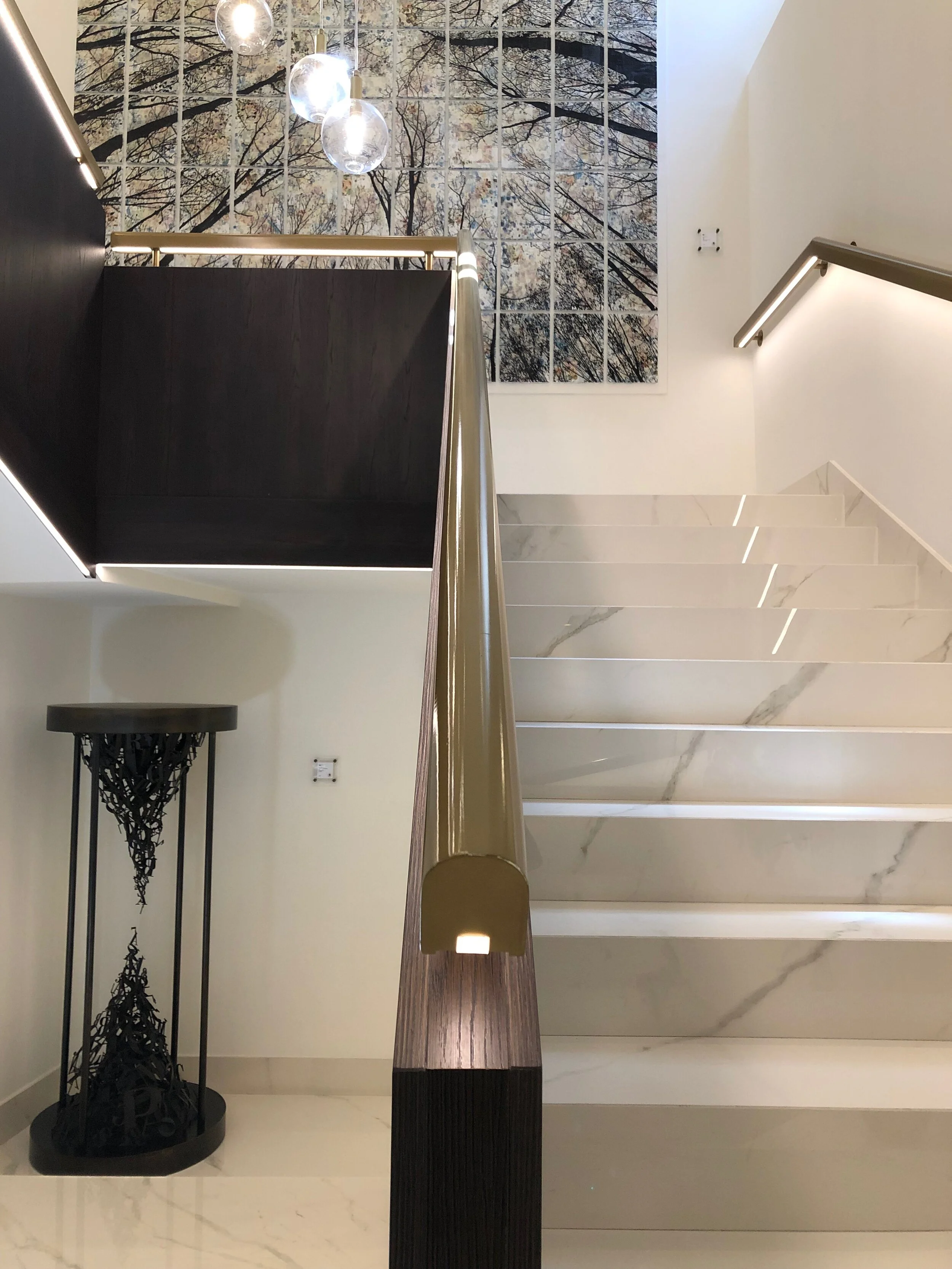
![Manuel Felisi’s collage anchors the stair landing. [If you know the lighting designer / manufacturer for the light fixtures, please let us know.]](https://images.squarespace-cdn.com/content/v1/557030b7e4b093e99ed82634/1568324170363-CYEYSO2HG19OND0L85S2/IMG_7480.jpg)