Eldridge Street Synagogue

IMG_9047.jpg

In a recent design inspiration trip to New York City, a last minute tour became the true highlight. As always, the trip included many hours walking the NYC streets, studying facades and building details, meandering through the Metropolitan Museum of Art, and if I’m being honest, eating bagels. The agenda also included the Tenement Museum where you can select from various behind-the-scenes tours to better understand tenement and immigrant life in the 1800 and 1900s. As a descendant of Sicilian immigrants (this is Judy talking) who arrived and settled in NY, I have long been intrigued with the hardships, courage, and work ethic of my grandparents and others who left everything in search of a better life. It was there when the Eldridge Street Synagogue, a landmark synagogue from 1887 and just a few blocks away, was suggested as a follow-up tour.

The docent shared that the Eldridge Street Synagogue was likely the first house of worship built for Jewish immigrants from Eastern Europe in America. It was designed by the Herter Brothers who were also the architects of several nearby tenement buildings (the better ones) and was their first synagogue. The building was embraced and well-used for decades until its members began moving out of the neighborhood; synagogues are located in the same neighborhood so members can walk to worship on the Sabbath. This shift in the neighborhood sadly resulted in the worship space being closed off (a smaller subset still worshipped in the lower level) and it subsequently fell into disrepair. During the 1980s, the Eldridge Street Project formed to stabilize and restore the structure. After 20 years and $20 million, it became a National Historic Landmark and working museum.

IMG_2029.jpg

Architecturally, the barrel vaulted space is striking, if not surprising, with Moorish detailing, gold and blue hues , stained glass and pendant light fixtures. The construction budget was tight yet the direction from the client was to make it ornate. To that end, no wall was left unadorned including painting the columns to look like marble. The pews were perhaps a result of value engineering as they are from a catalogue and harken to Christian trinity symbolism. No matter, the design moment that solidifies the story for me is the stunning rose window above the ark. It is the only contemporary design element in the space since the original window was destroyed. I am always a fan of the meaningful and graceful juxtaposition of ‘new and old’. As the museum website describes, “A final crowning element was the addition of a monumental stained-glass rose window by artist Kiki Smith and architect Deborah Gans in 2010. This beautiful sacred artwork is the only contemporary element in the main sanctuary. It marks the revitalization of the building in the 21st century, the most recent chapter in a story that is ever evolving.” The poignancy, symbolism and beauty is best described by the designers themselves; click here for a more in-depth explanation.

IMG_8833.jpg

For something that almost didn’t happen, touring the Museum at Eldridge Street has become a favorite lesson of mine as it tells a story of architecture, historic preservation, immigrants and the power of community.

*****

[Back to neighborhoods ebbing and flowing, while the building was originally located in the heart of the Jewish Lower East Side it is now part of Chinatown. The building exterior was hard to fully absorb because the Chinese New Year parade was simultaneously happening outside which I am not sad about…]

Distillery Homework

We are nothing but life-long learners and curious creatives. The discovery and research phase of a new project is when we immerse ourselves in the client / industry and where relevant pieces of information are uncovered; we may not know exactly how they will be incorporated in the final project design, if at all, but we collect them none the less as we begin to conceptualize a design. After a period (sometimes short, sometimes long) of researching, studying and marinating with the history, images, precedents collected - the design concept is crafted with memories of these discoveries.

When we began the design phase for Firefly Distillery’s new facility, the first step was to visit their existing distillery and tasting room on Wadmalaw Island, SC to learn their history, better understand their brand, see their process, and well, taste some products. It was important for us to know how Firefly started and where they were going, how they differentiated themselves in the industry and thus what functional spaces and visitor experiences to help create in the architecture.

Original Firefly Tasting Room located in an old horse barn on Wadmalaw Island, SC.

Original Firefly Tasting Room located in an old horse barn on Wadmalaw Island, SC.

Products on display and for sale inside the Tasting Room.

Products on display and for sale inside the Tasting Room.

Becoming experts in Firefly’s brand and business was only the first step. We needed to visit other distilleries with successful brands, products and distillery tours, so the team headed to Kentucky for some serious homework. (There are worse things to have on one’s To-do list.) The goal was to visit several distilleries of varying size and personality to study the visitor experience - this was not to replicate any one of them, rather to understand varying ways to showcase a brand, tell a story and how the built environment supports the experience. We’re not going to lie - a great time was had by all; but more importantly, the research trip provided countless moments to document and reference during the next year of design work.

BUFFALO TRACE

Located in Frankfurt, KY, Buffalo Trace is a National Historic Landmark and heavy hitter with over 20 brands including Van Winkle, Sazarac Rye and Wheatley Vodka. Take aways include their expansive, historic campus, choice of multiple tours and events (including a behind the scenes “hard hat” tour, path of a bourbon barrel tour and a ghost tour), and how their rustic brand is reinforced throughout the grounds in both big and small ways.

DSC_0518.JPG
Inside of one of the historic rickhouse structures.

Inside of one of the historic rickhouse structures.

Buffalo Trace logo cut into a stormwater grate.

Buffalo Trace logo cut into a stormwater grate.

WOODFORD RESERVE

The drive to Woodford Reserve in Versailles, KY was exactly how you wanted it to be, with horses and expanses of blue grass. While this distillery has a rich history as well, we noticed the polish and exactness they incorporated into the visitor experience.

Woodford Reserve’s information counter with backlit bottles.

Woodford Reserve’s information counter with backlit bottles.

There was a precise balance between the historic structure, distillery function and visitor experience.

There was a precise balance between the historic structure, distillery function and visitor experience.

The Woodford Reserve tasting experience was restrained, elegant and on-brand.

The Woodford Reserve tasting experience was restrained, elegant and on-brand.


COPPER & KINGS

In Louisville, KY our first stop was Copper & Kings, a newer distillery with an industrial aesthetic using shipping containers to greet you, a large courtyard for events and a steel, glass and concrete distillery. Bonus: they play music in the cellar for their barrels while they age. (Related: this blog was written to John Coltrane.)

Shipping container welcome center and gift shop for Copper & Kings.

Shipping container welcome center and gift shop for Copper & Kings.

Large outdoor courtyard with gathering spaces, fire pit and places to project movies.

Large outdoor courtyard with gathering spaces, fire pit and places to project movies.

Barrels age to music at the Copper & Kings’ cellar because “Brandy Rocks!” They post the day’s playlist on their website.

Barrels age to music at the Copper & Kings’ cellar because “Brandy Rocks!” They post the day’s playlist on their website.


ANGELS ENVY

Another stop in Louisville was Angel’s Envy, a VERY large facility that felt like a cathedral to distilling in the best way possible. It was reverent with grand spaces, a clear focus on education and showcasing the process and finished product.

Angel’s Envy Distillery map

Angel’s Envy Distillery map

IMG_E4482.jpg
The tallest column we have ever seen.

The tallest column we have ever seen.

Our design process is richer because we walked through these spaces, listened to the stories told and became students again. We are ever thankful for the hospitality shown to us and look forward to visiting again.


Inspiration from Roma - Elizabeth Unique Hotel

As architects in Charleston, we are students of history successfully meeting modernity and seek out those moments when homage is paid to historic structures with meaningful renovations for current day functions. During a recent visit to Rome, we found ourselves in one such transformation at the Palazzo Pulieri Ginetti - the Elizabeth Unique Hotel. An ancient palazzo, lush and thoughtful interiors by Studio Marincola Architects, art curated by the nearby Russo Art Gallery - it’s a wonder we ever left. The architects, interior designers, artists and craftspeople involved with this hotel design struck the perfect balance of honoring the historic vessel it inhabits while offering an environment that is somehow bold and restrained at the same time; the details were as powerful as the overarching effect. Bravo, we will be learning from this one for a long time.

Entry lobby. Artist: Enrico Benetta

Entry lobby. Artist: Enrico Benetta

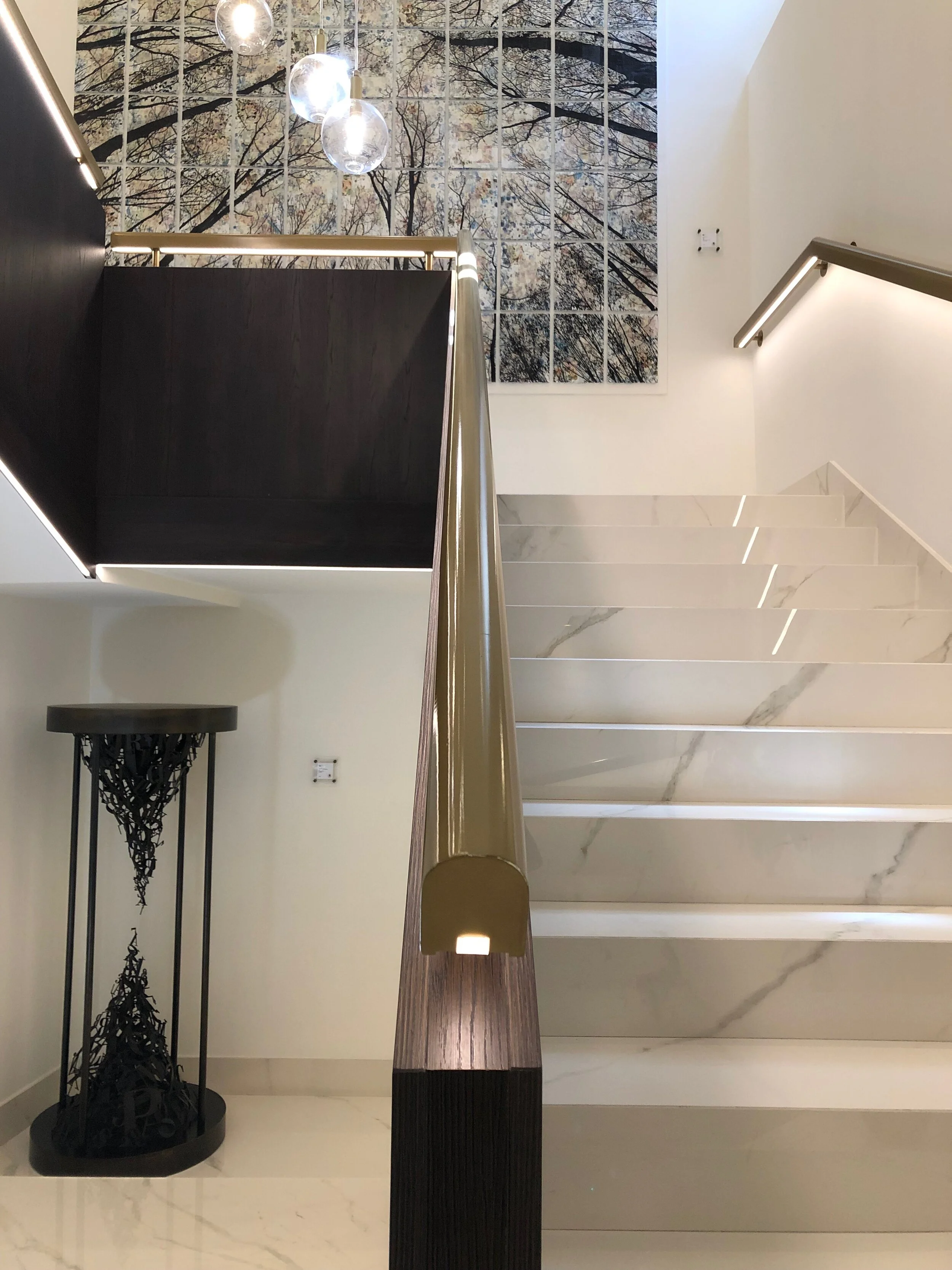
Monumental stair design was perfection: carrara marble, lighted gold handrails with dark wood guards. Sculpture: Enrico Benetta

Monumental stair design was perfection: carrara marble, lighted gold handrails with dark wood guards. Sculpture: Enrico Benetta

Manuel Felisi’s collage anchors the stair landing. [If you know the lighting designer / manufacturer for the light fixtures, please let us know.]

Manuel Felisi’s collage anchors the stair landing. [If you know the lighting designer / manufacturer for the light fixtures, please let us know.]

Edited entry into the room, neutral colors, arches are introduced with gold accents.

Edited entry into the room, neutral colors, arches are introduced with gold accents.

Old meets new: vintage black and white sceneries printed on wall covering adds a nostalgic layer but the execution and composition is quite contemporary.

Old meets new: vintage black and white sceneries printed on wall covering adds a nostalgic layer but the execution and composition is quite contemporary.

Probably the best color of blue we have ever seen was introduced on the wall separating the sleeping area from the utilities. You can see the gold accents better here.

Probably the best color of blue we have ever seen was introduced on the wall separating the sleeping area from the utilities. You can see the gold accents better here.

Giorgio Tentolini’s wire net artworks. This person is a genius.

Giorgio Tentolini’s wire net artworks. This person is a genius.

“Dandelion” by Enrico Benetta

“Dandelion” by Enrico Benetta

Sketches from Roma

“Traveling - it leaves you speechless then turns you into a storyteller.” Battuta

Professor Rodriguez did a very comprehensive job teaching our History of Architecture classes at Virginia Tech back in the day, but nothing compares to standing in front of or inside these architectural giants and studying by drawing. Here are some of the rough travel sketches, mostly exploring scale, form and massing, from our recent trip to Rome.

Our favorite view within the Piazza Del Popolo is of the (seamingly) twin churches Santa Maria di Montesano (left, 1662-75) and Santa Maria dei Miracoli (right, 1675-79) with the ancient Egyptian obelisk centered and Via del Corso starting between t…

Our favorite view within the Piazza Del Popolo is of the (seamingly) twin churches Santa Maria di Montesano (left, 1662-75) and Santa Maria dei Miracoli (right, 1675-79) with the ancient Egyptian obelisk centered and Via del Corso starting between the churches.

Closer view of the Santa Maria di Montesano in the Piazza del Popolo; not shown is the Italian street performer next to me singing ‘Sweet Dreams’ by the Eurythmics.

Closer view of the Santa Maria di Montesano in the Piazza del Popolo; not shown is the Italian street performer next to me singing ‘Sweet Dreams’ by the Eurythmics.

IMG_7354.JPG
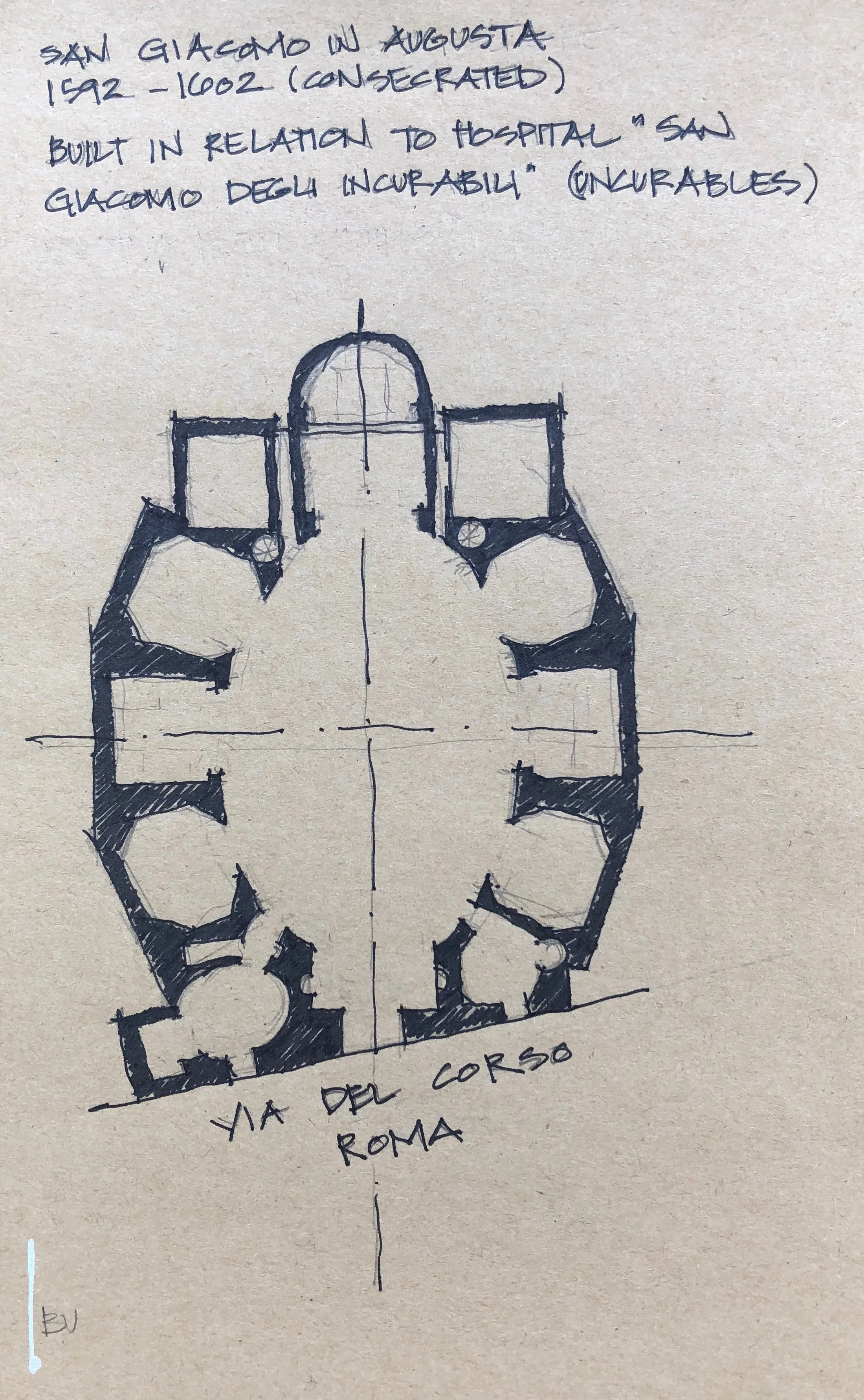
There is a church every turn you make in Rome. San Giacomo in Augusta was next to our hotel and after walking past it for days, we finally peeked in…speechless. Decided to draw the floor plan to convey the mass, construction and robustness.

There is a church every turn you make in Rome. San Giacomo in Augusta was next to our hotel and after walking past it for days, we finally peeked in…speechless. Decided to draw the floor plan to convey the mass, construction and robustness.

Interior of Santa Sabina on Aventine Hill, one of the seven hills of Rome. This sketch was rushed and does not come close to conveying the scale and reverence of this space. May need to sketch this one again.

Interior of Santa Sabina on Aventine Hill, one of the seven hills of Rome. This sketch was rushed and does not come close to conveying the scale and reverence of this space. May need to sketch this one again.

This gives you an idea of scale of Santa Sabina, if the door was this big.

This gives you an idea of scale of Santa Sabina, if the door was this big.

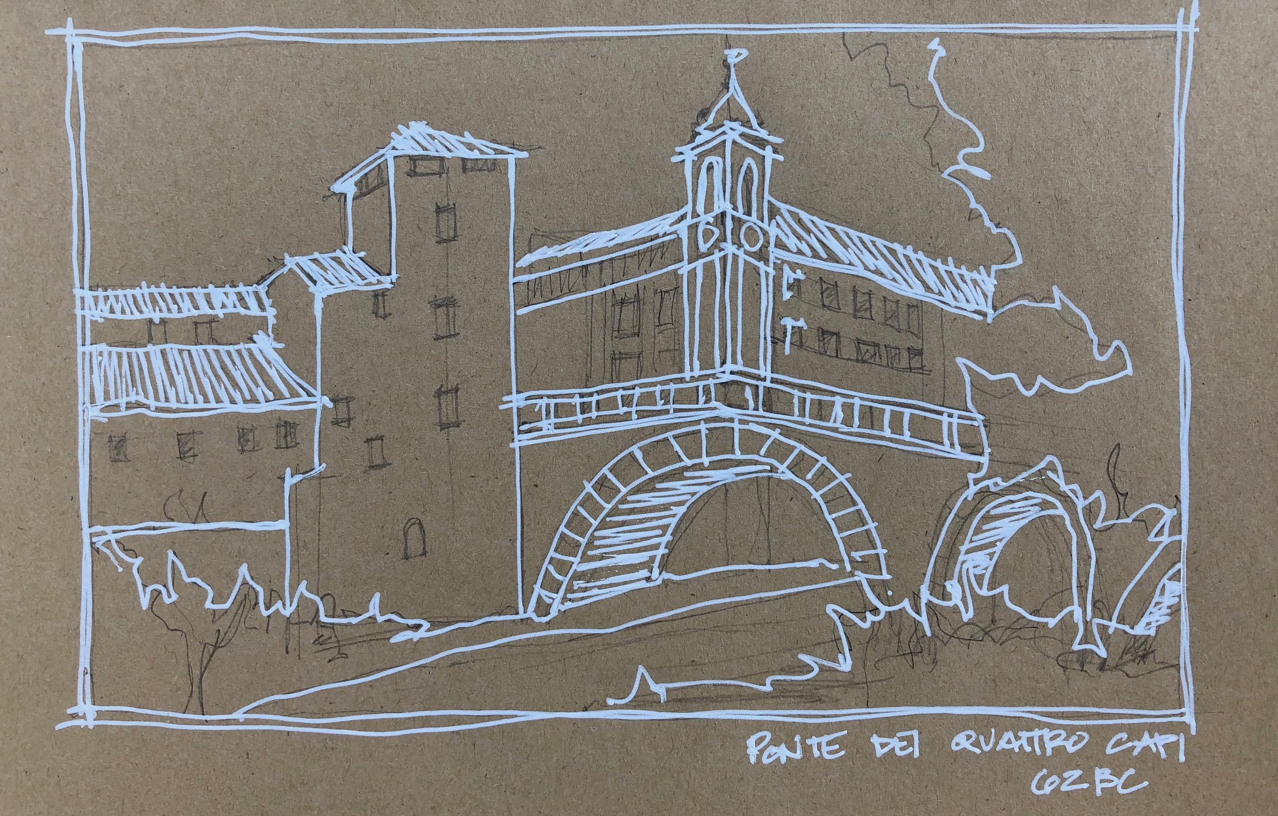
The Ponte dei Quattro Capi bridge is from 62 BC.

The Ponte dei Quattro Capi bridge is from 62 BC.

Historic architecture and fabric was the main focus, but finding Richard Meier’s modern Ara Pacis Museum was a highlight.

Historic architecture and fabric was the main focus, but finding Richard Meier’s modern Ara Pacis Museum was a highlight.