Rotational Symmetry | What it is and why we love it

If you went to architecture school, you may have had that professor that liked to take your drawings or cardboard models and flip them upside down. While it may have been insulting at first, the forced change of perspective often did result in unforeseen and hidden moments of inspiration. It's amazing how often the "flip” finds its way into our daily design process. "Rotational Symmetry" is one such flipping technique that is all around us. You’ll see it in graphic & logo design, industrial design, product design, and even the occasional building. Sometimes the solution is purely aesthetic and symbolic: think of the Yin & Yang symbol or the Recycling logo, each element wrapping around itself. Sometimes the solution is purely functional: think of the repeated blades of a wind turbine or the cogs of a gear. We find the notion of repeating a single component in a not-so-obvious way to create whole new forms, geometries, or spaces to be endlessly fascinating.

Examples of Rotational Symmetry in Architecture:

Symmetry and balance have been revered as architectural tenets for centuries, going back to Vitruvius’s Ten Books on Architecture circa 1st century Rome and before. When people say something has symmetry, they are usually referencing the use of an implied “Line of Symmetry” where each side of the object is a mirror to the other. Rotational symmetry goes one step further with repeating a form or mass around a fixed point. Intrigued by the notion of ‘complexity within simplicity’ and creating a measured dynamic, we studied historical precedents that inspired many of our recent designs.

DAYFIELD PARK

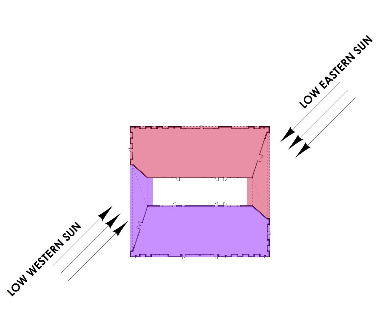
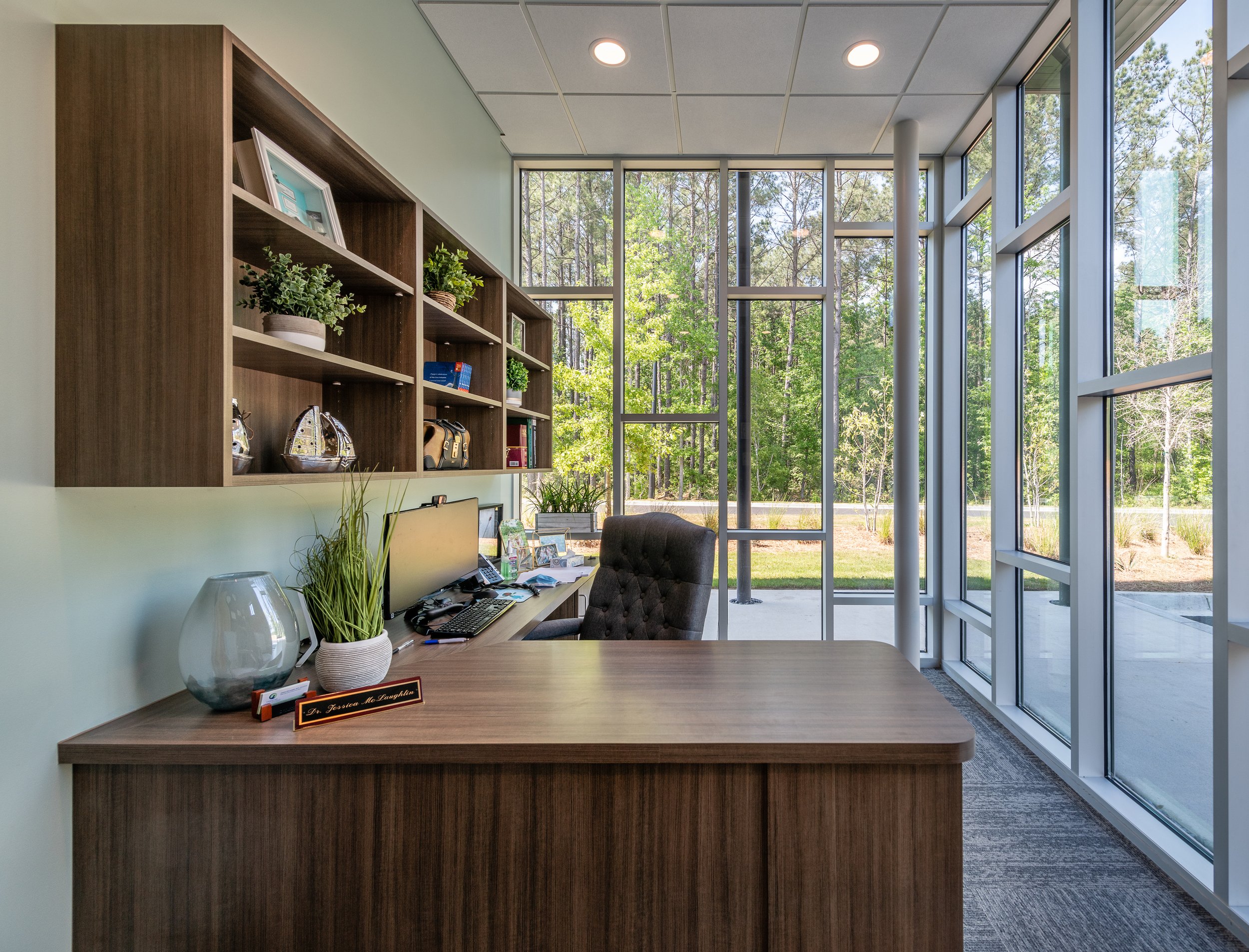
The design approach for Building B at Dayfield Park, a soon to be commercial destination in the award-winning Nexton Community, is rooted in strong massing, innovative detailing and creating an inspiring place to work and do business. The program included providing space for offices and retail tenants in a single story building while creating a unique and modern business park that engaged with adjacent green spaces and supported the current day work place expectations. The resulting design used rotational symmetry to leverage the square footprint by creating a central courtyard and through two overhead ‘thresholds’. The dynamic suggestion is amplified by angled walls and highly textured surfaces. Click here for more about the project.
RDA’S SUBMISSION FOR THE NORTH CHARLESTON FLAG

Earlier this year, the City of North Charleston launched a public design competition to select a new City flag. One of the symbols used in our submission was a reference to Park Circle (a derivative of a Garden City urban plan). By deconstructing the graphic and using rotational symmetry, we were able to invoke dynamics as if in rotating motion. Click here for more on our flag design.

CAMP HALL PARK PAVILION

Santee Cooper’s Camp Hall is a next generation commerce park where “people, nature and productivity connect.” With state-of-the-art manufacturing in a setting of vast natural beauty, the design concept of “Nature and the Machine” permeates the built environment. Like the vehicles and machines produced in Camp Hall, the Architecture is intended to embody precision, sleekness and innovation. The building forms are abstract interpretations of the patterns, colors, and figures found in nature. Specifically, the Park Pavilion uses rotational symmetry to create a subtle dynamic-ness of the roof planes. Click here for more on the project.
FIREFLY DISTILLERY GIFT SHOP FIXTURES

Part of our scope when we were designing Firefly Distillery’s new facility in North Charleston, SC was to carry the building’s design concepts to the gift shop merchandise fixtures. Using barrel lids, steel pipes, and rotational symmetry, a simple solution was created.

10 Books on Design (+ Independent Bookstores to Buy Them From)

Here is a new take on last year’s Top 10 Gift Guide - Designer Edition, focusing our attention exclusively on books related to the built environment, architecture, graphic and urban design. Some of these titles have been the subject of our previous musings, which are linked in the descriptions below, and some are new titles for us to share. All have provided inspiration, education, new perspectives and sometimes a welcomed escape. Of course, these are best purchased from your local independent book store; if they are not already on the shelves, they can order for you! Some of our local favorites include Turning Page Bookshop in Goose Creek, Blue Bicycle Books in Charleston, The Village Bookseller in Mount Pleasant and the Itinerant Literate Bookstop in North Charleston. Add your favorite independent bookseller in the comments.


Vignelli Transit Maps

Peter B. Lloyd with Mark Ovenden

This book chronicles the Italian designer Massimo Vignelli, respectfully called the Maestro, as he pushed the world of graphic design by reimagining the transit maps of New York City and Washington DC and forcing the question ‘Can a diagram be a map?’ (Spoiler alert: yes, it can). His designs were not always embraced by all as evidenced in the Great Subway Map Debate in New York City, but always provided a thoughtful, rigorous, innovative and modern approach. This book is for those who enjoy the behind the scenes sketches and iterations of the design process and how Vignelli navigated the very public process of iconic way finding.


Lake|Flato: Nature place craft restraint

Lake Flato Architects

We have long been fans of the regional and poignant architecture of the Lake Flato team based in Austin and San Antonio, Texas; somehow the architects create epic yet humble spaces again and again at every scale and in a range of building types. This book hones in on four priorities or aspects of their design language (nature, place, craft and restraint) by presenting several of their buildings/spaces in each category. When we were in San Antonio earlier this year we stumbled upon The Pearl and knew immediately this was a gathering place that was created with a high level of creativity, commitment to history and urban place-making. Lake Flato’s work “calls attention not to itself, but to other, more pertinent aspects of the human experience.” (Kengo Kuma)


The Home Edit

Clea Shearer + Joanna Teplin

We are big fans of creating order out of chaos. Ashton Kutcher recently shared in Architectural Digest, “To feel tranquility in a space, everything needs to be in order. If the world around you isn’t in order, it’s hard to get your brain in order.” The Home Edit is a room-by-room, how-to guide to edit, organize, display/store and enjoy your possessions. It can be a little overwhelming (and extra), but if you feed off of your built environment like we do, there are definitely some strategies here that you can make your own.


30A Living

Eleanor Lynn Nesmith

If you follow our travels you have seen images from Rosemary Beach, Alys Beach and Seaside, Florida - all coastal towns along Highway 30A. From town planning principles from the creative minds of Andres Duany + Elizabeth Plater-Zyberk to the architectural fabric and details created, we find inspiration again and again. This book is a curated view and escape into nine different communities with Jean Allsopp’s photos of exterior architecture, interior design and gulf views.


CHARLESTON FANCY

Witold Rybczynski

We are a little late to the party of Witold Rybczynski’s “Charleston Fancy - Little Houses + Big Dreams in the Holy City” published in 2019 by Yale University Press, but we are here now. Rybczyncki, the celebrated architect, professor and author captures a compelling movement in Charleston metro’s built environment, urban planning and architecture world. This book shares layers of historic renovations, lessons from medieval town planning and new urbanism through interviews with local master builders, developers and designers on the reverent and humane places they have created.

Click here for our Musings Blog for a more in-depth description.


New homes for today

Paul Williams

Continuing our study of the noteworthy African-American architect, Paul R. Williams (1894 - 1980), we have been pouring over his book published in 1946, “New Homes for Today.” The plan book is light on words and heavy on images which is just how us visual learners like it. While Mr. Williams had a wide multi-faceted career based in Los Angeles, including the design of public buildings, working for the Navy and designing over 2,000 homes (even that of Frank Sinatra!), this book focuses on smaller homes, perhaps for the middle class. The structure of the book itself allows just two pages for each house design and includes the description, floor plan and classic-now-vintage perspective renderings. Home names like “The Flamingo” and “The Country Gentleman” start to paint a picture of each home’s character.

Click here for our Musings Blog for a more in-depth description.


rural studio: Samuel mockbee + an architecture of decency

Andrea Oppenheimer Dean + Timothy Hursley

This book chronicles the genesis and early years of Auburn University’s College of Architecture, Design and Construction’s “Rural Studio”, a design-build architecture studio located off-campus in rural Alabama. The studio educates what founder, Samuel Mockbee, calls “citizen architects” through feet-on-the-ground researching, community immersion, collaborative design and hands-on construction in Hale County’s ‘pockets of poverty.’ What started as a new house per year has grown into chapels, community buildings and structures for much needed economic development. Paramount lessons beyond design and construction are those in human decency, class and racial differences and how both client and student are equally helping one another.

Click here for our Musings Blog for a more in-depth description.


the new old house

Marc Kristal

Practicing architecture in the history-rich Charleston metro area often has us thinking about how new buildings or additions should interact with historic ones - the coexistence of present and past. Marc Kristal tackles the dialogue in his book, “The New Old House” with eighteen built examples of homes that combine historic and modern architecture. This discussion becomes one of preservation (sometimes with a flexible approach), function, aesthetics, respect and sustainability.

Click here for our Musings Blog for a more in-depth description.


fire island modernist: Horace Gifford + the architecture of secuction

Christopher Bascom Rawlins

Architect Christopher Rawlins crafts this comprehensive look at the often overlooked architect Horace Gifford (1932 - 1992), his approach to design, portfolio of seaside pavilions and houses with in the broader context of personal challenges, social and cultural movements. “As the 1960s became The Sixties, architect Horace Gifford executed a remarkable series of beach houses that transformed the terrain and culture of New York's Fire Island. Growing up on the beaches of Florida, Gifford forged a deep connection with coastal landscapes. Pairing this sensitivity with jazzy improvisations on modernist themes, he perfected a sustainable modernism in cedar and glass that was as attuned to natural landscapes as to our animal natures. Gifford's serene 1960s pavilions provided refuge from a hostile world, while his exuberant post-Stonewall, pre-AIDS masterpieces orchestrated bacchanals of liberation.” Rawlins

Click here for our Musings Blog for a more in-depth description.


LIVING WITH PATTERN: COLOR, TEXTURE, AND PRINT AT HOME

Rebecca Atwood

As lovers of solids (usually black or grey if we are being honest) we recognize that working with color and pattern can be our blindspot. Who better to learn from than Rebecca Atwood, artist, textile designer and a recent addition to the Charleston creative space (lucky us), with her book “Living with Pattern: Color, Texture, and Print at Home.” This beautiful reference, including photographs by Emily Johnston, is organized in three main parts in addition to resources and sourcing lists. First is a design and reference ‘primer’ allowing the reader to hone their personal point of view; second is a room-by-room guide with real life examples of inspired spaces; the third section includes projects for the reader to begin their own journey. In her words, “We are all filled with contradictions, and that’s what makes life interesting. Pattern can reflect your particular oppositions, interests, aspirations, and views of the world.”

Details of Rome

We fully recognize that as architects we are not normal tourists; we look up, we look down, we try to figure out floor plans, we look at the tiny details and run our hands over walls. It’s a little extra but this is how we learn. Therefore most of our travel photos are not of the typical framed postcard views, rather small moments that catch our breath and tell a story. Here are some details from our pre-pandemic trip to Rome.

IMG_1226.jpg
IMG_1246.jpg
IMG_1247.jpg
IMG_7393.jpg
IMG_1339.jpg
IMG_E7390.jpg
IMG_1269.jpg
We weren’t the first to look through the Aventine keyhole (see photo above for a close up) near S. Sabina which gives a perfectly framed view of St. Peter’s Basilica on axis, through the gardens.  Read more about it here.

We weren’t the first to look through the Aventine keyhole (see photo above for a close up) near S. Sabina which gives a perfectly framed view of St. Peter’s Basilica on axis, through the gardens. Read more about it here.